
原生JS怎么实现响应式网格照片墙
深入讲解如何使用纯原生 JavaScript 结合 CSS 变量实现自适应屏幕宽度的响应式网格照片墙,涵盖几何算法推导、视口监听防抖、图片懒加载及灯箱模态预览交互。
实现响应式网格照片墙的核心,是通过原生 JavaScript 实时监听容器宽度与视口尺寸,基于预设的最小卡片宽度和间距动态解算出最佳列数,再将计算结果注入 CSS 变量或栅格样式中;配合 IntersectionObserver 懒加载以及单例事件委托,即可脱离任何外部框架,打造出加载迅速、无布局抖动且支持全屏预览的高性能照片墙。

一、响应式网格照片墙的计算核心
很多初学者在制作照片墙时,习惯于写死多组 CSS Media Queries(例如在 768px、1024px、1200px 处分别定义不同的 grid-template-columns)。这种方式在固定设备断点下尚可运转,但一旦照片墙被嵌入在侧边栏、可收缩抽屉或可拖拽分栏容器中,基于视口宽度的媒体查询就会失效,导致卡片过宽或排版溢出。
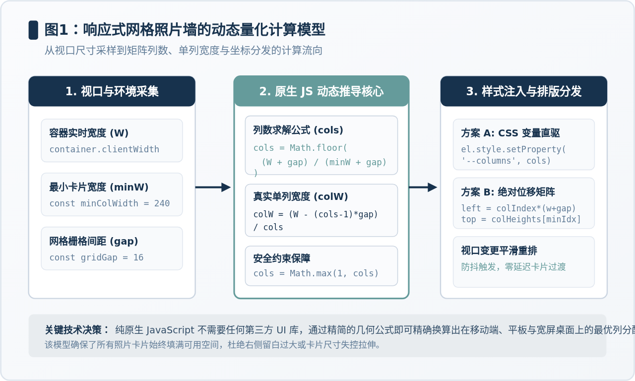
原生 JavaScript 方案的优势在于以容器实际宽度(container.clientWidth)为基准动态度量。我们只需要设定两个基本物理量:单个照片卡片的期望最小宽度(minColumnWidth)以及卡片间的间距(gap)。列数的推导遵循严谨的向下取整几何公式:
// 列数计算公式
const columns = Math.max(1, Math.floor((containerWidth + gap) / (minColumnWidth + gap)));

// 计算得到列数后,每列实际分配的精确宽度:
const actualColWidth = (containerWidth - (columns - 1) * gap) / columns;
通过该算法,无论容器宽度如何随窗口拖拽或分栏变动,JavaScript 都能瞬间推算出最恰当的列数(1 列、2 列或多列),并且保证每一列等宽铺满容器,完全规避右侧空白或过窄挤压的问题。
二、基础 HTML 骨架与 CSS 样式规范
构建响应式照片墙不需要冗余的多层嵌套。页面骨架只需包含一个主容器、卡片列表节点以及一个用于点击放大查看的全局灯箱模态层(Lightbox):
<!-- 照片墙主容器 -->
<div id="photoWallContainer" class="photo-wall">
<!-- 动态由 JS 注入卡片 -->
</div>
<!-- 全屏图片灯箱模态层 -->
<div id="photoLightbox" class="lightbox-modal" aria-hidden="true">
<div class="lightbox-content">
<span class="lightbox-close" id="lightboxClose">×</span>
<img id="lightboxImage" src="" alt="大图预览" />
</div>
</div>
在 CSS 方面,我们运用现代 CSS Grid 搭配 CSS 自定义属性(CSS Variables)。JavaScript 只需要在窗口变动时修改容器上的 --grid-columns 变量,样式的重绘与过渡完全交给浏览器渲染引擎完成:
.photo-wall {
  --grid-columns: 3;
  --grid-gap: 16px;
  display: grid;
  grid-template-columns: repeat(var(--grid-columns), 1fr);
  gap: var(--grid-gap);
  width: 100%;
}

.photo-card {
  position: relative;
  border-radius: 8px;
  overflow: hidden;
  background-color: #E2E8F0;
  /* 关键:设置固定宽高比,在图片加载完成前就撑开空间,防止发生布局偏移(CLS) */
  aspect-ratio: 4 / 3;
  cursor: pointer;
  transition: transform 0.25s ease, box-shadow 0.25s ease;
}

.photo-card:hover {
  transform: translateY(-4px);
  box-shadow: 0 8px 16px rgba(23, 50, 77, 0.12);
}

.photo-card img {
  width: 100%;
  height: 100%;
  object-fit: cover;
  display: block;
  opacity: 0;
  transition: opacity 0.35s ease-in-out;
}

/* 图片加载成功后淡入展示 */
.photo-card img.loaded {
  opacity: 1;
}
.photo-card 显式指定 aspect-ratio: 4 / 3(或 16 / 9、1 / 1)是非常关键的一步。若未预先约束卡片比例,在图片从网络下载完成之前卡片高度为 0,当多张图片陆续下载完毕时,页面高度会反复突跳,严重影响用户阅读体验并拉低 Core Web Vitals 评分。
三、原生 JavaScript 分步实现流程
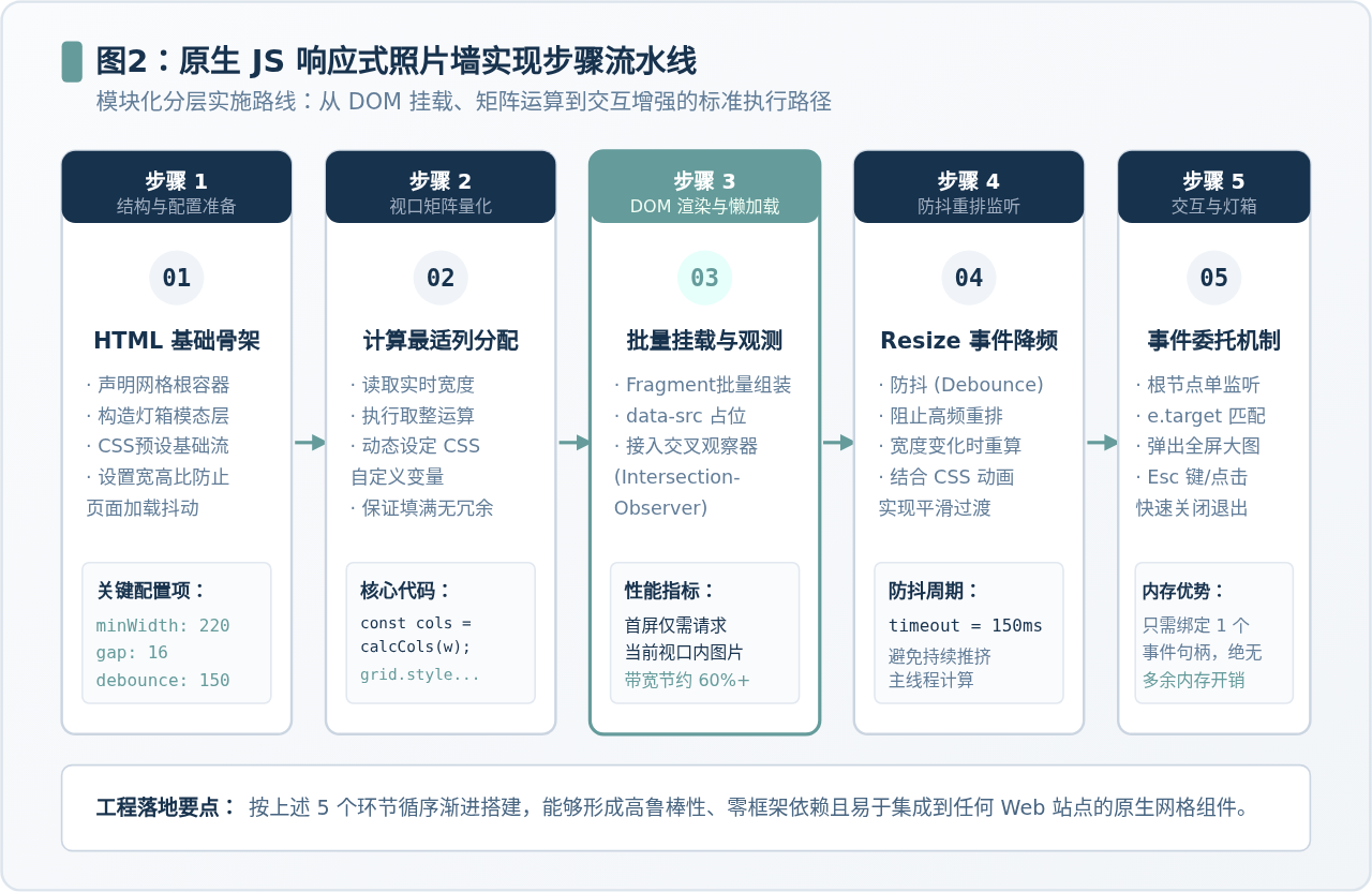
将实现逻辑拆解为五个清晰的步骤:配置初始化、视口矩阵量化、DOM 组装与懒加载、Resize 防抖监听、以及灯箱交互代理。
步骤 1:声明配置项与数据源
将布局核心参数抽离为独立配置,方便后续针对不同业务场景微调单列下限与间隙:
const PhotoWallConfig = {
  minColWidth: 220,    // 单张卡片允许的最小像素宽度
  gap: 16,             // 栅格横纵间距(像素)
  debounceDelay: 120   // 窗口调整时的防抖延迟(毫秒)
};

// 照片模拟数据列表(包含缩略图与高清大图)
const photoData = [
  { id: 1, title: '晨光海岸', thumb: 'https://picsum.photos/id/10/400/300', full: 'https://picsum.photos/id/10/1200/900' },
  { id: 2, title: '林间小径', thumb: 'https://picsum.photos/id/11/400/300', full: 'https://picsum.photos/id/11/1200/900' },
  { id: 3, title: '静谧山峦', thumb: 'https://picsum.photos/id/12/400/300', full: 'https://picsum.photos/id/12/1200/900' },
  { id: 4, title: '落日余晖', thumb: 'https://picsum.photos/id/13/400/300', full: 'https://picsum.photos/id/13/1200/900' },
  { id: 5, title: '都市天际', thumb: 'https://picsum.photos/id/16/400/300', full: 'https://picsum.photos/id/16/1200/900' },
  { id: 6, title: '林中溪流', thumb: 'https://picsum.photos/id/15/400/300', full: 'https://picsum.photos/id/15/1200/900' }
];
步骤 2:动态计算列数并更新 CSS 自定义变量
获取容器 DOM 元素的当前物理宽度,计算并写回 --grid-columns 变量:
function updateGridLayout(container, config) {
  const containerWidth = container.clientWidth;
  if (!containerWidth) return;

  // 使用向下取整算法计算当前宽度容纳的最适列数
  const rawCols = Math.floor((containerWidth + config.gap) / (config.minColWidth + config.gap));
  const cols = Math.max(1, rawCols); // 保障至少有 1 列

  // 动态更新 CSS 自定义属性
  container.style.setProperty('--grid-columns', cols);
  container.style.setProperty('--grid-gap', `${config.gap}px`);
}
步骤 3:DOM Fragment 批量组装与 IntersectionObserver 懒加载
一次性往 DOM 树频繁插入节点会引发多次 Reflow。我们采用 DocumentFragment 在内存中一次性组装完成,再挂载进容器。同时为 img 标签设置 data-src,利用 IntersectionObserver 仅当卡片滚动进入可视区域(或距离可视区 100px)时才触发真实网络请求:
// 创建懒加载观察器实例
const imageObserver = new IntersectionObserver((entries, observer) => {
  entries.forEach(entry => {
    if (entry.isIntersecting) {
      const img = entry.target;
      const trueSrc = img.dataset.src;
      if (trueSrc) {
        img.src = trueSrc;
        img.onload = () => {
          img.classList.add('loaded');
        };
      }
      // 加载后取消观察该元素,释放监听资源
      observer.unobserve(img);
    }
  });
}, {
  rootMargin: '100px 0px', // 提前 100px 预加载,避免滚动露白
  threshold: 0.01
});

function renderPhotos(container, list) {
  const fragment = document.createDocumentFragment();

  list.forEach(item => {
    const card = document.createElement('div');
    card.className = 'photo-card';
    card.dataset.fullSrc = item.full;
    card.dataset.title = item.title;

    const img = document.createElement('img');
    img.alt = item.title;
    img.dataset.src = item.thumb; // 真实地址暂存到 data-src

    const caption = document.createElement('div');
    caption.className = 'card-caption';
    caption.textContent = item.title;

    card.appendChild(img);
    card.appendChild(caption);
    fragment.appendChild(card);

    // 注册到懒加载观察器
    imageObserver.observe(img);
  });

  container.innerHTML = '';
  container.appendChild(fragment);
}
步骤 4:窗口调整(Resize)监听与防抖处理
当用户拖拽调整浏览器窗口尺寸时,window.resize 事件会在几毫秒内高频触发数百次。如果不加限制直接执行重排,会导致主线程拥堵。通过封装简洁的原生防抖函数(Debounce),使计算仅在拖动停顿后执行一次:
function debounce(fn, delay) {
  let timer = null;
  return function (...args) {
    if (timer) clearTimeout(timer);
    timer = setTimeout(() => {
      fn.apply(this, args);
    }, delay);
  };
}

// 绑定防抖缩放监听
const handleResize = debounce(() => {
  const container = document.getElementById('photoWallContainer');
  if (container) {
    updateGridLayout(container, PhotoWallConfig);
  }
}, PhotoWallConfig.debounceDelay);

window.addEventListener('resize', handleResize);
步骤 5:基于事件委托的全屏灯箱(Lightbox)预览
若为列表里的每一张卡片都独立绑定 addEventListener('click', ...),当照片达到数百张时会占用过多内存。正确的做法是利用事件冒泡机制,在父级容器上绑定单一监听,配合 e.target.closest('.photo-card') 快速命中点击项:
function initLightbox(container) {
  const modal = document.getElementById('photoLightbox');
  const modalImg = document.getElementById('lightboxImage');
  const closeBtn = document.getElementById('lightboxClose');

  // 事件委托:只监听父容器
  container.addEventListener('click', (e) => {
    const card = e.target.closest('.photo-card');
    if (!card) return;

    const fullSrc = card.dataset.fullSrc;
    if (fullSrc) {
      modalImg.src = fullSrc;
      modal.classList.add('active');
      modal.setAttribute('aria-hidden', 'false');
    }
  });

  // 关闭模态框逻辑
  const closeModal = () => {
    modal.classList.remove('active');
    modal.setAttribute('aria-hidden', 'true');
    modalImg.src = '';
  };

  closeBtn.addEventListener('click', closeModal);
  modal.addEventListener('click', (e) => {
    if (e.target === modal) closeModal();
  });

  // 支持键盘 ESC 退出预览
  document.addEventListener('keydown', (e) => {
    if (e.key === 'Escape' && modal.classList.contains('active')) {
      closeModal();
    }
  });
}
四、视口断点与列宽间距矩阵对比
为了直观理解这套计算模型在不同终端硬件下的适配效果,我们将各档典型视口下的列数分配和展示形态梳理如下:

五、可直接运行的完整综合代码示例
以下是集成上述所有模块的单文件完整代码,开箱即用。你可以直接将其保存为 .html 文件在任意浏览器中双击打开运行:
<!DOCTYPE html>
<html lang="zh-CN">
<head>
<meta charset="UTF-8">
<meta name="viewport" content="width=device-width, initial-scale=1.0">
<title>原生JS响应式网格照片墙</title>
<style>
* { box-sizing: border-box; margin: 0; padding: 0; }
body {
font-family: -apple-system, sans-serif;
background: #FAFBFD;
padding: 24px;
}
.gallery-wrap {
max-width: 1200px;
margin: 0 auto;
}
.photo-grid {
--cols: 3;
--gap: 16px;
display: grid;
grid-template-columns: repeat(var(--cols), 1fr);
gap: var(--gap);
width: 100%;
}
.photo-item {
position: relative;
border-radius: 8px;
overflow: hidden;
background: #E2E8F0;
aspect-ratio: 4 / 3;
cursor: pointer;
box-shadow: 0 2px 8px rgba(0,0,0,0.06);
transition: transform 0.2s ease, box-shadow 0.2s ease;
}
.photo-item:hover {
transform: translateY(-4px);
box-shadow: 0 8px 16px rgba(23, 50, 77, 0.15);
}
.photo-item img {
width: 100%;
height: 100%;
object-fit: cover;
display: block;
opacity: 0;
transition: opacity 0.3s;
}
.photo-item img.loaded {
opacity: 1;
}
.photo-item .tag {
position: absolute;
bottom: 0; left: 0; right: 0;
padding: 8px 12px;
background: linear-gradient(transparent, rgba(15,23,42,0.8));
color: #FFF;
font-size: 13px;
}
/* 灯箱 */
.lightbox {
position: fixed; inset: 0;
background: rgba(15,23,42,0.9);
display: none; align-items: center; justify-content: center;
z-index: 1000;
}
.lightbox.show { display: flex; }
.lightbox img { max-width: 90vw; max-height: 85vh; border-radius: 6px; }
.close-btn {
position: absolute; top: 20px; right: 30px;
color: #FFF; font-size: 32px; cursor: pointer;
}
</style>
</head>
<body>
<div class="gallery-wrap">
<div id="myGrid" class="photo-grid"></div>
</div>
<div id="lightbox" class="lightbox">
<span class="close-btn" id="closeBtn">×</span>
<img id="previewImg" src="" alt="预览图">
</div>
<script>
const CONFIG = { minColWidth: 220, gap: 16, debounceTime: 120 };
// 生成测试数据
const photos = Array.from({ length: 12 }, (_, i) => ({
id: i + 1,
title: `风光摄影作品 #${i + 1}`,
thumb: `https://picsum.photos/id/${i + 20}/400/300`,
full: `https://picsum.photos/id/${i + 20}/1200/900`
}));
const gridEl = document.getElementById('myGrid');
const lightboxEl = document.getElementById('lightbox');
const previewImg = document.getElementById('previewImg');
const closeBtn = document.getElementById('closeBtn');
// 1. 动态列数计算
function refreshColumns() {
const w = gridEl.clientWidth;
if (!w) return;
const cols = Math.max(1, Math.floor((w + CONFIG.gap) / (CONFIG.minColWidth + CONFIG.gap)));
gridEl.style.setProperty('--cols', cols);
}
// 2. 懒加载器
const observer = new IntersectionObserver((entries, obs) => {
entries.forEach(entry => {
if (entry.isIntersecting) {
const img = entry.target;
img.src = img.dataset.src;
img.onload = () => img.classList.add('loaded');
obs.unobserve(img);
}
});
}, { rootMargin: '80px' });
// 3. 渲染
function initGallery() {
const frag = document.createDocumentFragment();
photos.forEach(item => {
const div = document.createElement('div');
div.className = 'photo-item';
div.dataset.full = item.full;
div.innerHTML = `
<img data-src="${item.thumb}" alt="${item.title}">
<div class="tag">${item.title}</div>
`;
frag.appendChild(div);
observer.observe(div.querySelector('img'));
});
gridEl.appendChild(frag);
refreshColumns();
}
// 4. 防抖缩放
function debounce(fn, wait) {
let t;
return (...args) => {
clearTimeout(t);
t = setTimeout(() => fn(...args), wait);
};
}
window.addEventListener('resize', debounce(refreshColumns, CONFIG.debounceTime));
// 5. 事件委托预览
gridEl.addEventListener('click', e => {
const item = e.target.closest('.photo-item');
if (!item) return;
previewImg.src = item.dataset.full;
lightboxEl.classList.add('show');
});
const close = () => {
lightboxEl.classList.remove('show');
previewImg.src = '';
};
closeBtn.addEventListener('click', close);
lightboxEl.addEventListener('click', e => {
if (e.target === lightboxEl) close();
});
document.addEventListener('keydown', e => {
if (e.key === 'Escape') close();
});
// 启动
initGallery();
</script>
</body>
</html>
六、生产环境常见问题与避坑指南
在实际项目中将网格照片墙推向生产环境时,通常会遇到以下三个典型场景,需要特别注意应对方法:
-
容器隐藏时的尺寸为 0 导致列数归零:
如果照片墙被置于 Tab 标签页、折叠手风琴或尚未激活的弹窗中,容器的
clientWidth可能会返回 0。此时切勿直接将--cols设为 0(这会导致 CSS 语法错误)。必须在函数首部执行if (!containerWidth) return;保护拦截,并在切换 Tab 激活该面板时手动触发一次重排。 -
图片比例各异时的网格拉伸:
若后台图片长宽比各不相同,直接使用
<img>可能会导致一行内卡片高低不齐。务必在卡片外层设定固定aspect-ratio,并将内部图片设置为object-fit: cover,以居中裁剪的方式维持严格整齐的网格矩形;或者根据图片尺寸分组采用真正的瀑布流(Masonry)绝对定位方案。 -
高分屏(Retina)下的图片清晰度平衡:
移动端屏幕设备像素比(DPR)普遍为 2 或 3,如果直接输出 1:1 像素的缩略图,在手机端放大后会出现边缘模糊。建议在动态拼接图片 URL 参数时,根据
window.devicePixelRatio动态为缩略图宽增加 1.5 到 2 倍冗余,在流量与视觉锐利度之间取得最佳平衡。

七、总结
使用原生 JavaScript 实现响应式网格照片墙并不复杂,其核心逻辑在于“逻辑层算列数、样式层管渲染、浏览器管平滑”。我们通过纯粹的数学除法将视口像素映射为最适列数,借助 CSS 自定义属性触发网格自适应,再辅以 IntersectionObserver 懒加载和防抖机制,最终在不需要导入数兆大型 UI 框架的前提下,实现了一个轻巧、高效且体验细腻的原生照片墙组件。
JS在setTimeout或Ajax回调中打开新标签页失败怎么处理
2026-11-05 15:50:12
JS直播协议选型:HLS、FLV与WebRTC的延迟与兼容性对比
2026-11-05 12:16:14
JS实现回到顶部:scrollTop赋值与浏览器兼容性处理
2026-11-04 23:43:35
JS使用classList动态添加、移除和切换CSS类名
2026-11-04 23:40:58
在 D3.js 中实现平滑过渡动画的技巧
2026-11-03 23:46:09
相关标签: