
Swiper.js 自定义分页器和导航按钮样式技巧
深入讲解 Swiper.js 中自定义分页器与导航按钮样式的实用技巧,涵盖 CSS 覆盖、伪元素图标替换、renderBullet 动态模板及外部容器挂载方案。
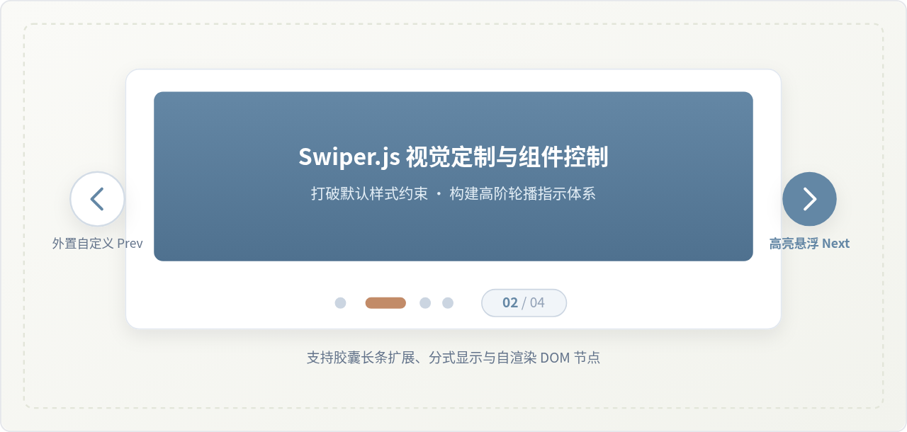
Swiper.js 提供了开箱即用的轮播交互体验,但其默认的深蓝圆形小点和双线箭头往往与产品视觉规范存在冲突。自定义 Swiper 的核心路径分为两层:基础场景通过 CSS 覆写内置类名、清除默认伪元素图标;进阶场景则利用 Swiper 配置项中的 renderBullet、type 以及挂载选择器,将控件脱离原生容器束缚,构建出形态丰富的指示体系。
一、Swiper 控件的 DOM 结构与样式挂载逻辑
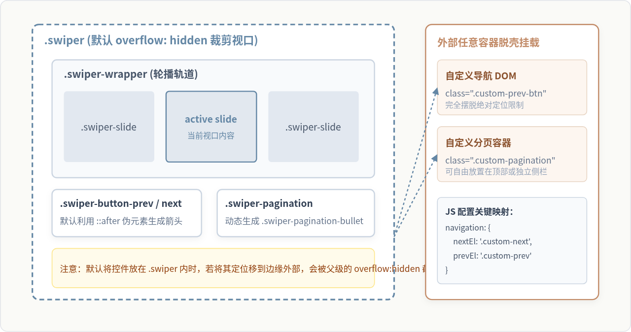
理解 Swiper 控件样式的起点是弄清其真实的 DOM 结构。默认情况下,分页器 .swiper-pagination 与导航按钮 .swiper-button-prev、.swiper-button-next 均作为子节点直接放置在 .swiper 根容器内部。
在 Swiper v8、v9、v10 等现代版本中,导航按钮的默认箭头并不是传统内联图片,而是通过 ::after 伪元素的字体图标或背景 SVG 渲染而成,并带有固定字号(--swiper-navigation-size: 44px)。分页器的小圆点则是由 JavaScript 动态插入的 <span class="swiper-pagination-bullet"> 标签。
二、导航按钮(Prev / Next)的三种定制方案
许多开发者在修改 .swiper-button-prev 样式时,直接写 color 或 background,却发现默认箭头仍然顽固存在。这是因为没有清除官方样式表中强加的伪元素。以下是规范化的定制流程:
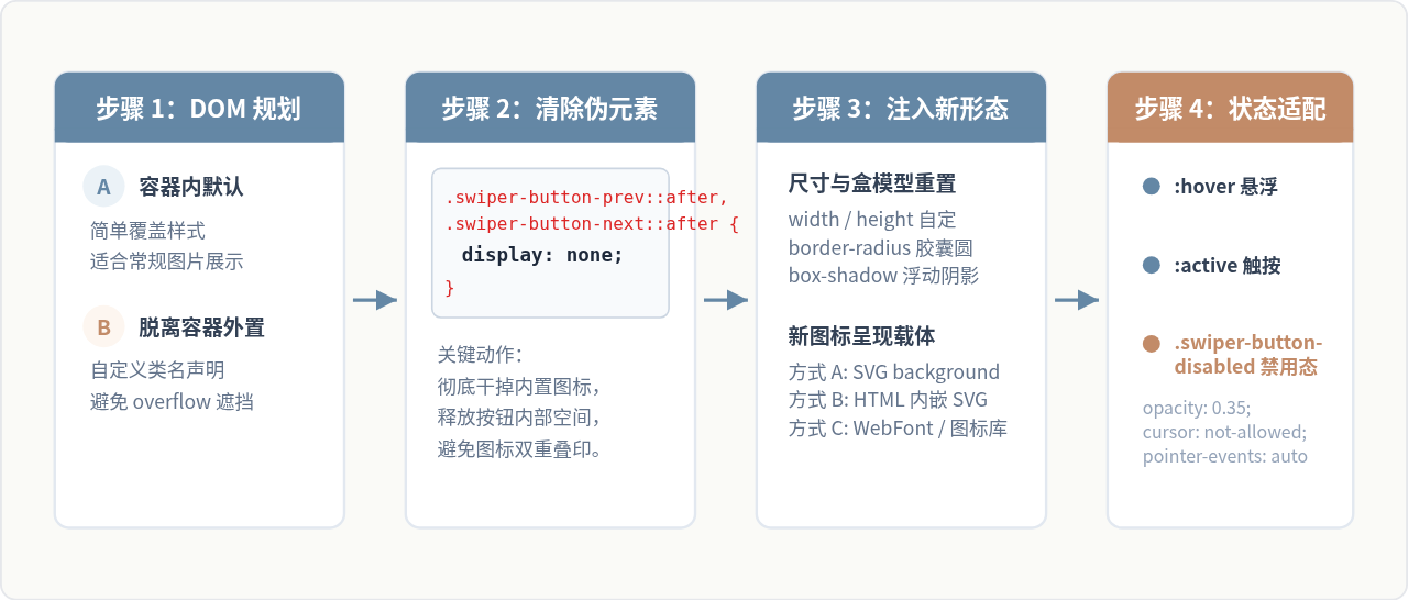
方案一:通过 CSS 伪元素彻底清空与重绘
最稳妥的做法是将自带的 ::after 隐藏,直接把宽高设置在按钮主体上,并配合背景图或内嵌 SVG 完成造型:
/* 1. 清空默认字体图标 */
.swiper-button-prev::after,
.swiper-button-next::after {
  display: none;
}

/* 2. 重置按钮本体为圆形卡片样式 */
.swiper-button-prev,
.swiper-button-next {
  width: 44px;
  height: 44px;
  background-color: #FFFFFF;
  border-radius: 50%;
  box-shadow: 0 4px 14px rgba(0, 0, 0, 0.1);
  display: flex;
  align-items: center;
  justify-content: center;
  transition: all 0.25s ease;
  border: 1px solid #E2E8F0;
}

/* 3. 通过内联 SVG 注入全新矢量箭头 */
.swiper-button-prev {
  background-image: url("data:image/svg+xml,%3Csvg xmlns='http://www.w3.org/2000/svg' fill='none' viewBox='0 0 24 24' stroke='%236487A5' stroke-width='2.5'%3E%3Cpath stroke-linecap='round' stroke-linejoin='round' d='M15 19l-7-7 7-7'/%3E%3C/svg%3E");
  background-repeat: no-repeat;
  background-position: center;
  background-size: 20px 20px;
}

.swiper-button-next {
  background-image: url("data:image/svg+xml,%3Csvg xmlns='http://www.w3.org/2000/svg' fill='none' viewBox='0 0 24 24' stroke='%236487A5' stroke-width='2.5'%3E%3Cpath stroke-linecap='round' stroke-linejoin='round' d='M9 5l7 7-7 7'/%3E%3C/svg%3E");
  background-repeat: no-repeat;
  background-position: center;
  background-size: 20px 20px;
}

/* 4. 交互微动效 */
.swiper-button-prev:hover,
.swiper-button-next:hover {
  background-color: #6487A5;
  box-shadow: 0 6px 18px rgba(100, 135, 165, 0.35);
  transform: translateY(-2px);
  /* 悬停时替换为白色反色箭头 */
  filter: brightness(0.95);
}

/* 5. 到达边界时的禁用态处理 */
.swiper-button-prev.swiper-button-disabled,
.swiper-button-next.swiper-button-disabled {
  opacity: 0.35;
  cursor: not-allowed;
  pointer-events: none; /* 禁用点击响应 */
  transform: none;
  box-shadow: none;
}
方案二:直接在 HTML 中编写原生子元素并配置 external 选择器
如果你希望按钮内部拥有复杂的 HTML 结构(例如图标旁跟随“上一页 / 下一页”文字,或者需要根据深色模式动态切换 fill),可以直接在 DOM 中写自定义结构,在初始化时通过 CSS 选择器进行挂接:
<!-- HTML 布局:按钮置于 swiper 外部任意位置 -->
<div class="slider-header-controls">
  <button type="button" class="my-arrow-btn my-arrow-prev" aria-label="上一页">
    <svg width="18" height="18" viewBox="0 0 24 24" fill="none" stroke="currentColor" stroke-width="2">
      <polyline points="15 18 9 12 15 6"></polyline>
    </svg>
    <span>PREV</span>
  </button>
  <button type="button" class="my-arrow-btn my-arrow-next" aria-label="下一页">
    <span>NEXT</span>
    <svg width="18" height="18" viewBox="0 0 24 24" fill="none" stroke="currentColor" stroke-width="2">
      <polyline points="9 18 15 12 9 6"></polyline>
    </svg>
  </button>
</div>

<script>
  const swiper = new Swiper('.my-swiper-container', {
    modules: [Navigation, Pagination],
    navigation: {
      prevEl: '.my-arrow-prev',
      nextEl: '.my-arrow-next',
      disabledClass: 'my-arrow-disabled', // 可自定禁用类名
    },
  });
</script>
三、分页器(Pagination)样式定制:从几何形变到 renderBullet 模板
Swiper 自带四种类型的分页器:bullets(圆点,默认)、fraction(分式数字)、progressbar(顶部进度条)以及 custom。
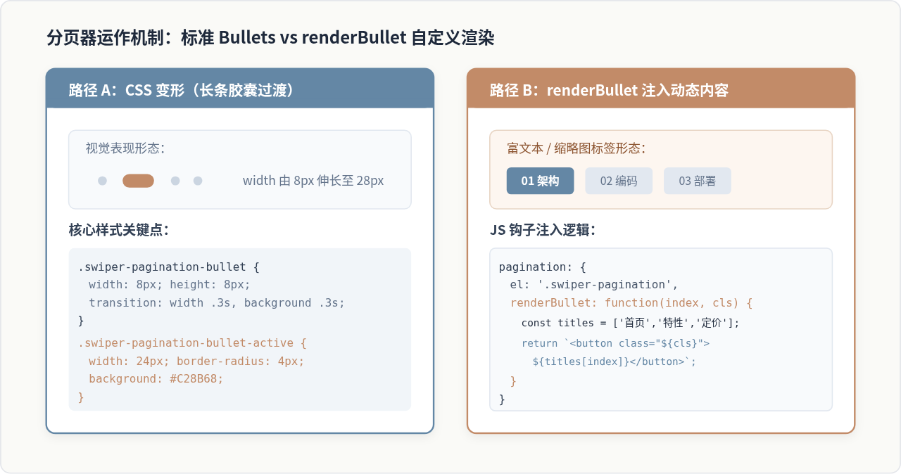
技巧一:打造流行的高级胶囊线条(Pill Indicator)
很多现代 UI(如车载界面或应用引导页)偏好使用带有长度弹性动画的胶囊指示条。实现这个效果无需动用 JS,只需利用 CSS 的 transition 属性过渡宽度与透明度:
/* 基础圆点通用属性 */
.swiper-pagination-bullet {
  width: 8px;
  height: 6px;
  background-color: #94A3B8;
  opacity: 0.4;
  border-radius: 3px;
  margin: 0 4px !important;
  transition: width 0.35s cubic-bezier(0.4, 0, 0.2, 1),
              background-color 0.35s ease,
              opacity 0.35s ease;
}

/* 激活项平滑拉伸变为长条胶囊 */
.swiper-pagination-bullet-active {
  width: 28px;
  background-color: #6487A5;
  opacity: 1;
  border-radius: 3px;
}
技巧二:利用 renderBullet 渲染数字分页与标签卡
当轮播图作为多步向导、文章目录或商品 Tab 时,简单的圆点无法承载信息。通过 pagination.renderBullet 钩子函数,我们可以接收当前幻灯片索引 index 和系统类名 className,动态拼接自定义 HTML:
const tabNames = ['概览说明', '参数配置', '性能测试', '发布总结'];

const swiper = new Swiper('.swiper-feature', {
  modules: [Pagination],
  pagination: {
    el: '.swiper-pagination',
    clickable: true, // 允许点击切换
    renderBullet: function (index, className) {
      // 保证必须携带系统传入的 className(包含激活状态标记)
      const paddedNum = String(index + 1).padStart(2, '0');
      return `
        <div class="${className} custom-tab-item">
          <span class="tab-index">${paddedNum}</span>
          <span class="tab-title">${tabNames[index]}</span>
        </div>
      `;
    },
  },
});
配套 CSS 样式示例:
/* 撑开分页器容器使其水平分布 */
.swiper-pagination {
  position: static; /* 允许在文档流中正常排列 */
  display: flex;
  justify-content: center;
  gap: 12px;
  margin-top: 16px;
}

/* 覆盖 bullet 默认属性,重构为卡片 */
.custom-tab-item.swiper-pagination-bullet {
  width: auto;
  height: auto;
  background: #F1F5F9;
  border-radius: 6px;
  padding: 8px 16px;
  display: flex;
  align-items: center;
  gap: 8px;
  opacity: 0.7;
  border: 1px solid #E2E8F0;
  cursor: pointer;
  transition: all 0.2s ease;
}

.custom-tab-item .tab-index {
  font-weight: 700;
  font-size: 13px;
  color: #6487A5;
}

.custom-tab-item .tab-title {
  font-size: 13px;
  color: #334155;
}

/* 激活高亮样式 */
.custom-tab-item.swiper-pagination-bullet-active {
  background: #FFFFFF;
  border-color: #6487A5;
  box-shadow: 0 4px 12px rgba(100, 135, 165, 0.15);
  opacity: 1;
}

.custom-tab-item.swiper-pagination-bullet-active .tab-title {
  color: #1E293B;
  font-weight: 600;
}renderBullet 函数返回的根元素必须附带形参中传入的 className。Swiper 内部是通过在现有 class 上添加或移除 swiper-pagination-bullet-active 来标记当前页面的,若丢失该变量,分页器的激活状态绑定将全部失效。
四、生产环境常见问题与避坑决策导图
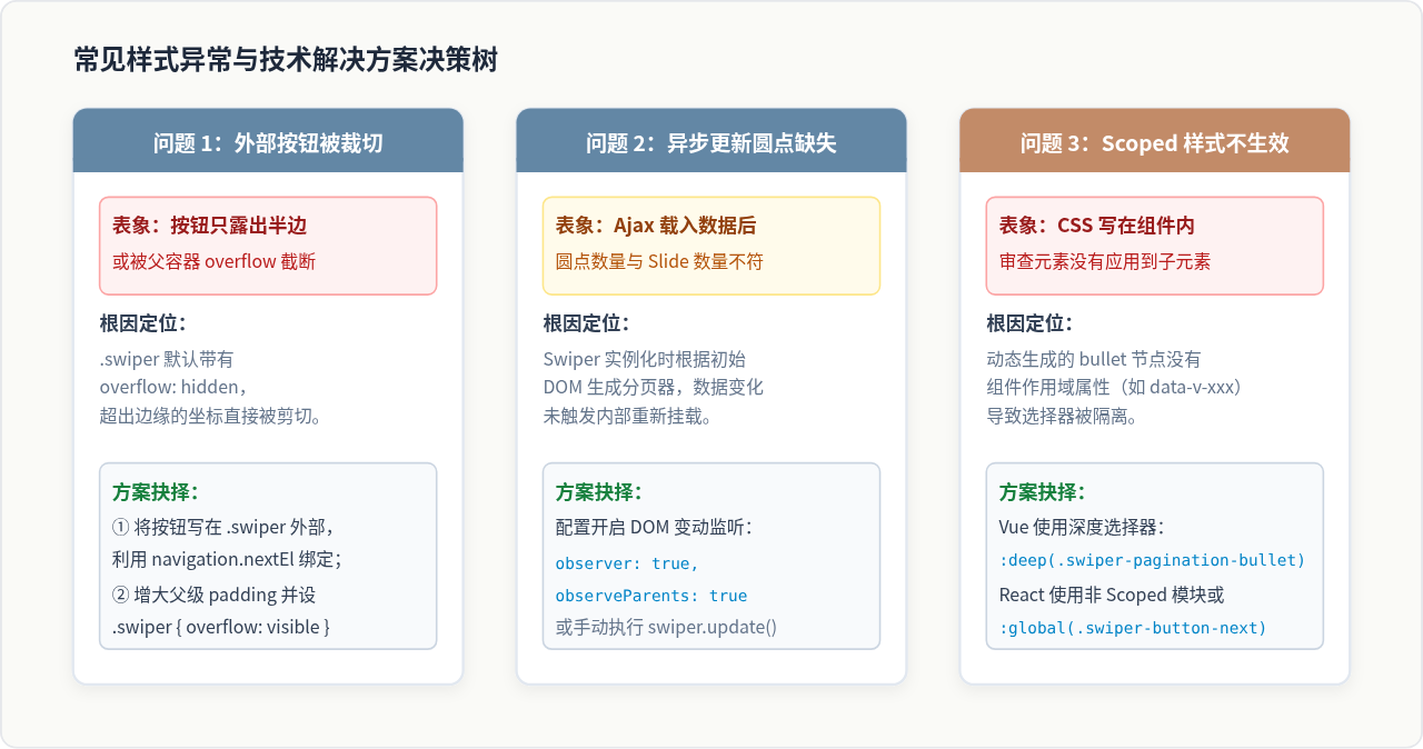
在将自定义样式投入真实工程环境时,经常会遇到各种层叠上下文、动态内容渲染或跨框架样式作用域的问题。以下总结了高频问题的排查线索与解决方案决策路径:
1. 容器外溢出(Overflow)与层级点击失效
当设计稿要求导航箭头“悬挂”在轮播图外侧时,最常见的做法是在 .swiper-button-prev 上设置负值定位(如 left: -50px)。但因为 .swiper 预设了 overflow: hidden,移出区域的内容会被立刻裁切。
- 解法 A(推荐):直接将按钮放置在
.swiper外部,通过外层包裹容器协同排版,并将选择器传给navigation.prevEl/nextEl。 - 解法 B:将
.swiper设置为overflow: visible,并在外层父级包裹一个更宽的视口遮罩。此时需要特别注意移动端手势滑动的事件边界。
2. 异步数据更新时的分页器同步
在现代 SPA 应用中,轮播列表常通过 API 异步拉取。如果 Swiper 在列表数据尚未填充前完成初始化,分页器小圆点将只按初始空列表渲染。推荐在初始化参数中显式开启监听属性:
const swiper = new Swiper('.my-slider', {
  observer: true,         // 监听自身 DOM 变动
  observeParents: true,   // 监听祖先 DOM 变动
  observeSlideChildren: true, // 监听子节点增减
  pagination: {
    el: '.swiper-pagination',
  },
});
开启上述配置后,当向 .swiper-wrapper 中追加新的 .swiper-slide 节点时,Swiper 内部 MutationObserver 会自动触发重绘,分页器数量和尺寸即可无缝刷新。
五、总结
自定义 Swiper.js 分页器与导航按钮的过程,本质上是在其事件管理机制与现代 CSS 规范之间建立合理的桥梁:
- 导航按钮:核心在于优先清除
::after默认字体图标,再注入自有的 SVG 矢量图或图标库;若遇到布局局限,果断采用脱离.swiper的外置挂载方案。 - 分页器:简单的形态变化优先使用纯 CSS transition 实现平滑胶囊形变;多维信息呈现则果断调用
renderBullet回调,在保持className传递的前提下注入自由的 DOM 结构。 - 工程落地:牢记在单页面框架中处理
:deep()作用域穿透,并在动态数据驱动场景开启observer保证视图与状态的时刻同步。
js-cookie 安装与基础用法:set、get、remove 详解
2026-11-05 16:35:06
适合JavaScript初学者的实战项目:制作简易待办事项列表
2026-11-05 16:17:07
JS打开新标签页时怎么通过URL传递参数
2026-11-05 12:21:08
sigma.js 自定义节点样式:设置颜色、大小及标签显示的技巧
2026-11-05 09:55:00
JS 生成的统计图怎么导出为 PNG 图片或 PDF 文件?
2026-11-05 09:37:58