
原生JavaScript封装可复用的Modal弹出层组件
本文深入讲解如何使用原生JavaScript封装一个高复用性、低耦合且体验完备的Modal弹出层组件,涵盖DOM分层架构、面向对象生命周期设计、滚动穿透防护、焦点捕获与无障碍支持等关键实践。
在Web交互界面中,Modal(模态弹出层/对话框)是承载核心交互、信息确认和复杂表单录入的重要元素。虽然现代前端框架(如React或Vue)提供了大量的UI组件库,但在微前端嵌入、旧项目渐进式升级、轻量脚本工具或追求极简依赖的开发场景中,脱离庞大框架依赖、基于原生JavaScript封装一个高可用且可复用的Modal组件依然是一项基础且关键的技术能力。本文将从架构设计、生命周期管理、事件调度机制及细节防坑四个维度,完整实现一个即插即用、具备高度扩展性的原生Modal类。
一、Modal组件的视觉分层与DOM架构剖析
一个健壮的弹出层绝不仅仅是一个简单的居中盒子,它在DOM结构和页面图层(Stacking Context)中具有明确的垂直分层要求。为了保证遮罩层能够准确阻断页面原有元素的交互,并防止被页面其他高层级元素遮挡,Modal在视觉与逻辑上由三个核心图层自底向上构成:宿主页面文档流、半透明全局遮罩层(Overlay/Backdrop)以及模态对话框容器(Modal Container)。
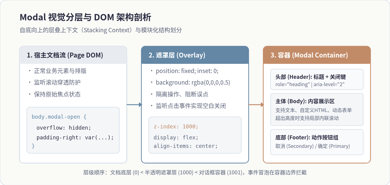
在设计DOM节点时,切忌将Modal容器直接塞入深层嵌套的业务父级组件中。这是因为父级容器如果设置了 overflow: hidden、transform 或 filter 属性,会导致子元素的 position: fixed 表现降级或产生局部剪裁。因此,复用组件必须直接将遮罩节点挂载到 document.body 根层级下,确保图层层叠关系的纯净与独立。
二、基于ES6 Class的面向对象封装与生命周期设计
为了让Modal具备良好的可复用性,我们使用ES6 class 进行面向对象抽象。一个设计良好的组件应该具备清晰的生命周期:从配置参数合并、DOM节点构建、事件监听绑定、开启动画驱动,到最终的销毁清理,整个执行链路应当单向清晰、闭环受控。
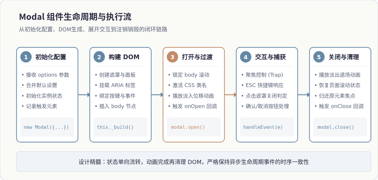
1. 默认配置设计与合并机制
为了让调用者用最少的参数完成初始化,我们需要在类内部定义完备的默认配置项,包括:标题、内容文本或HTML片段、确认与取消按钮文字、是否显示关闭图标、点击遮罩是否允许关闭、按下ESC是否关闭,以及相关事件回调函数。
const DEFAULT_OPTIONS = {
  title: '提示',
  content: '',
  width: '480px',
  showClose: true,
  closeOnOverlay: true,
  closeOnEsc: true,
  confirmText: '确定',
  cancelText: '取消',
  showCancel: true,
  destroyOnClose: false, // 关闭后是否完全销毁DOM
  onOpen: () => {},
  onClose: () => {},
  onConfirm: () => {},
};
三、核心方法实现与关键交互细节打磨
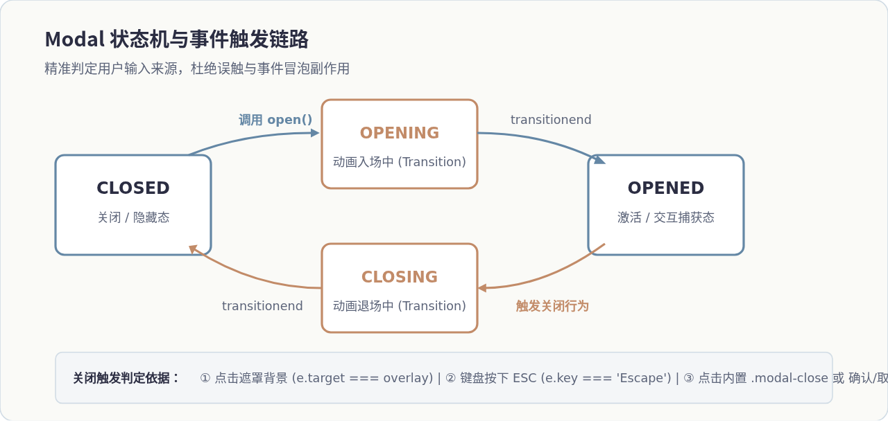
很多简单的Modal实现往往只关注“显示”与“隐藏”的样式切换,而在实际生产环境中,缺乏交互细节的弹窗会引发诸如页面背景滚动穿透、内容区点击被误判为遮罩关闭、连续快速点击导致状态撕裂等一系列严重体验问题。我们必须通过精细的状态机管理和边界条件判定来消除这些隐患。
1. 滚动穿透与页面抖动锁定
当Modal展开时,若用户在遮罩上滑动鼠标滚轮或触摸移动,底部的网页内容容易随之滚动,这被称为“滚动穿透”。传统的做法是直接给 document.body 设置 overflow: hidden;。但在桌面端浏览器中,页面滚动条突然隐藏会导致视口有效宽度瞬间增加(通常为 15px~17px),从而引发整个页面内容向右突兀抖动。
优雅的解决方案是在隐藏滚动条的同时,动态计算当前滚动条宽度,并为 body 补充对应的 padding-right:
_lockScroll() {
  const scrollbarWidth = window.innerWidth - document.documentElement.clientWidth;
  this._originalBodyPadding = document.body.style.paddingRight || '';
  this._originalBodyOverflow = document.body.style.overflow || '';

  if (scrollbarWidth > 0) {
    document.body.style.paddingRight = `${scrollbarWidth}px`;
  }
  document.body.style.overflow = 'hidden';
}

_unlockScroll() {
  document.body.style.paddingRight = this._originalBodyPadding;
  document.body.style.overflow = this._originalBodyOverflow;
}
2. 遮罩层误触阻断与事件冒泡防御
很多开发者在绑定遮罩点击关闭时,简单监听了遮罩节点的 click 事件:
// 错误示例:点击弹窗内部区域事件冒泡到overlay,导致意外关闭!
overlay.addEventListener('click', () => this.close());
如果仅仅这样监听,用户在弹窗内容区点击输入框、文字或按钮时,事件会沿着DOM树向上冒泡至遮罩层,导致弹窗意外关闭。正确的解法是严格比对事件源目标:只有当 e.target === this.overlay 时才触发关闭。同时,在弹窗内容容器上显式调用 e.stopPropagation() 提供双重保险。
3. 键盘无障碍支持与焦点循环 (Focus Trap)
根据 WAI-ARIA 规范,一个合规的模态对话框应当具有键盘可访问性:
- 按下
Escape键应当能够快速退出对话框。 - 打开弹窗时,保存当前获得焦点的页面元素(
document.activeElement),以便在弹窗关闭后将焦点无缝归还。 - 在弹窗打开期间,用户的
Tab键导航应当被限制在弹窗内的可聚焦元素(按钮、输入框、链接)之间循环,不能跑到底层不可见的页面中。
四、完整的Modal组件源码与开箱即用示例
结合上述设计,我们将CSS样式、HTML模板组装与JavaScript控制逻辑完整整合为一个独立的通用模块。该实现自带默认样式注入,确保外部无须手动引入CSS文件即可运行。
/**
* 原生可复用 Modal 对话框组件
*/
class Modal {
static _styleInjected = false;
constructor(options = {}) {
this.options = {
title: '系统提示',
content: '',
width: '460px',
showClose: true,
closeOnOverlay: true,
closeOnEsc: true,
confirmText: '确定',
cancelText: '取消',
showCancel: true,
destroyOnClose: true,
onOpen: () => {},
onClose: () => {},
onConfirm: () => {},
...options
};
this.isOpen = false;
this.isAnimating = false;
this.overlay = null;
this.previousActiveElement = null;
this._boundOnKeyDown = this._onKeyDown.bind(this);
Modal._injectStyles();
this._initDOM();
}
static _injectStyles() {
if (Modal._styleInjected) return;
const style = document.createElement('style');
style.id = 'pure-modal-styles';
style.textContent = `
.p-modal-overlay {
position: fixed;
inset: 0;
background-color: rgba(43, 45, 66, 0.45);
backdrop-filter: blur(2px);
display: flex;
align-items: center;
justify-content: center;
z-index: 1000;
opacity: 0;
visibility: hidden;
transition: opacity 0.25s cubic-bezier(0.4, 0, 0.2, 1), visibility 0.25s;
}
.p-modal-overlay.is-active {
opacity: 1;
visibility: visible;
}
.p-modal-container {
background: #ffffff;
border-radius: 8px;
box-shadow: 0 10px 25px -5px rgba(0, 0, 0, 0.15), 0 8px 10px -6px rgba(0, 0, 0, 0.1);
width: 90%;
max-width: var(--modal-width, 460px);
max-height: 85vh;
display: flex;
flex-direction: column;
transform: translateY(12px) scale(0.98);
transition: transform 0.25s cubic-bezier(0.4, 0, 0.2, 1);
overflow: hidden;
}
.p-modal-overlay.is-active .p-modal-container {
transform: translateY(0) scale(1);
}
.p-modal-header {
padding: 16px 20px;
display: flex;
align-items: center;
justify-content: space-between;
border-bottom: 1px solid #E8ECF0;
}
.p-modal-title {
font-size: 1.1rem;
font-weight: 600;
color: #2B2D42;
margin: 0;
}
.p-modal-close-btn {
background: transparent;
border: none;
font-size: 20px;
line-height: 1;
color: #5C6479;
cursor: pointer;
padding: 4px;
border-radius: 4px;
}
.p-modal-close-btn:hover { color: #2B2D42; background: #F0F4F8; }
.p-modal-body {
padding: 20px;
font-size: 0.95rem;
color: #374151;
overflow-y: auto;
line-height: 1.6;
}
.p-modal-footer {
padding: 12px 20px;
display: flex;
justify-content: flex-end;
gap: 10px;
border-top: 1px solid #E8ECF0;
background: #FAFAF7;
}
.p-modal-btn {
padding: 8px 16px;
border-radius: 6px;
font-size: 0.9rem;
cursor: pointer;
font-weight: 500;
border: 1px solid transparent;
transition: all 0.15s ease;
}
.p-modal-btn-cancel {
background: #FFFFFF;
border-color: #D1DCE5;
color: #5C6479;
}
.p-modal-btn-cancel:hover { background: #F0F4F8; color: #2B2D42; }
.p-modal-btn-confirm {
background: #6487A5;
color: #FFFFFF;
}
.p-modal-btn-confirm:hover { background: #51718D; }
`;
document.head.appendChild(style);
Modal._styleInjected = true;
}
_initDOM() {
this.overlay = document.createElement('div');
this.overlay.className = 'p-modal-overlay';
this.overlay.setAttribute('role', 'dialog');
this.overlay.setAttribute('aria-modal', 'true');
this.overlay.style.setProperty('--modal-width', this.options.width);
const closeBtnHtml = this.options.showClose
? '<button class="p-modal-close-btn" aria-label="关闭">×</button>'
: '';
const cancelBtnHtml = this.options.showCancel
? `<button class="p-modal-btn p-modal-btn-cancel">${this.options.cancelText}</button>`
: '';
this.overlay.innerHTML = `
<div class="p-modal-container">
<div class="p-modal-header">
<h3 class="p-modal-title">${this.options.title}</h3>
${closeBtnHtml}
</div>
<div class="p-modal-body">${this.options.content}</div>
<div class="p-modal-footer">
${cancelBtnHtml}
<button class="p-modal-btn p-modal-btn-confirm">${this.options.confirmText}</button>
</div>
</div>
`;
this._bindEvents();
document.body.appendChild(this.overlay);
}
_bindEvents() {
this.overlay.addEventListener('click', (e) => {
if (this.options.closeOnOverlay && e.target === this.overlay) {
this.close();
}
});
const closeBtn = this.overlay.querySelector('.p-modal-close-btn');
if (closeBtn) {
closeBtn.addEventListener('click', () => this.close());
}
const cancelBtn = this.overlay.querySelector('.p-modal-btn-cancel');
if (cancelBtn) {
cancelBtn.addEventListener('click', () => this.close());
}
const confirmBtn = this.overlay.querySelector('.p-modal-btn-confirm');
if (confirmBtn) {
confirmBtn.addEventListener('click', () => {
const shouldClose = this.options.onConfirm();
if (shouldClose !== false) {
this.close();
}
});
}
}
_onKeyDown(e) {
if (this.options.closeOnEsc && e.key === 'Escape') {
this.close();
}
}
_lockScroll() {
const scrollbarWidth = window.innerWidth - document.documentElement.clientWidth;
this._originalBodyPadding = document.body.style.paddingRight || '';
this._originalBodyOverflow = document.body.style.overflow || '';
if (scrollbarWidth > 0) {
document.body.style.paddingRight = `${scrollbarWidth}px`;
}
document.body.style.overflow = 'hidden';
}
_unlockScroll() {
document.body.style.paddingRight = this._originalBodyPadding;
document.body.style.overflow = this._originalBodyOverflow;
}
open() {
if (this.isOpen || this.isAnimating) return;
this.isAnimating = true;
this.previousActiveElement = document.activeElement;
this._lockScroll();
window.addEventListener('keydown', this._boundOnKeyDown);
// 触发重绘以确保 transition 正常触发
void this.overlay.offsetWidth;
this.overlay.classList.add('is-active');
const container = this.overlay.querySelector('.p-modal-container');
const onEnd = () => {
container.removeEventListener('transitionend', onEnd);
this.isOpen = true;
this.isAnimating = false;
this.options.onOpen();
};
container.addEventListener('transitionend', onEnd);
}
close() {
if (!this.isOpen || this.isAnimating) return;
this.isAnimating = true;
window.removeEventListener('keydown', this._boundOnKeyDown);
this.overlay.classList.remove('is-active');
const container = this.overlay.querySelector('.p-modal-container');
const onEnd = () => {
container.removeEventListener('transitionend', onEnd);
this._unlockScroll();
this.isOpen = false;
this.isAnimating = false;
this.options.onClose();
if (this.previousActiveElement && this.previousActiveElement.focus) {
this.previousActiveElement.focus();
}
if (this.options.destroyOnClose && this.overlay.parentNode) {
this.overlay.parentNode.removeChild(this.overlay);
}
};
container.addEventListener('transitionend', onEnd);
}
setContent(html) {
const body = this.overlay.querySelector('.p-modal-body');
if (body) body.innerHTML = html;
}
}// 实例化并开启一个确认删除的对话框
const myModal = new Modal({
title: '确认删除',
content: '删除后数据将不可恢复,请确认是否继续操作?',
confirmText: '立即删除',
onConfirm: () => {
console.log('用户确认了操作');
// 返回 false 可阻止自动关闭弹窗
},
onClose: () => {
console.log('弹窗已关闭');
}
});
document.getElementById('deleteBtn').addEventListener('click', () => {
myModal.open();
});五、常见问题排查与工程化复用总结
将上述Modal投入到真实的多页面或复杂业务系统中时,开发者常常会遇到以下三个典型场景,可以根据需求灵活微调:
- Promise 化封装(静态快捷调用):在业务中更常见的调用方式是类似
Modal.confirm('确定要退出吗?')。我们可以在类上挂载一个静态方法,包装 Promise,将用户点击确定解析为resolve(true),点击取消或遮罩解析为resolve(false),大大降低业务心智负担。 - 多层弹窗堆叠(z-index 碰撞):当业务中存在弹窗唤起另一个提示弹窗时,固定
z-index: 1000会导致先打开的弹窗与后打开的弹窗层级冲突。可以在open()时动态读取全局当前最高 z-index 并自增赋值。 - 长列表/超长表单内容适配:将
.p-modal-container设置为display: flex; flex-direction: column; max-height: 85vh;,并将.p-modal-body设置为overflow-y: auto;。这样当文字或表单极长时,头部标题和底部操作按钮始终固定,仅中间主体区域滚动。
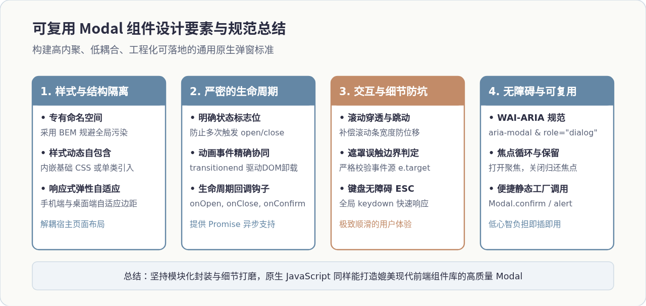
封装一个轻量、坚固的原生Modal组件,核心不仅在于几行DOM操作代码,更在于对用户交互细节、浏览器渲染行为以及边界异常情况的全面把控。通过合理抽象类的生命周期、防范滚动穿透、精细阻断冒泡,我们在不借助任何第三方类库的前提下,依然能够交付媲美现代UI框架的极致弹窗体验。
网页开发三者分工:HTML结构、CSS样式与JavaScript交互怎么协作
2026-11-05 12:51:22
JS解析URL参数时怎么处理中文乱码和特殊字符
2026-11-05 12:47:23
js-cookie 存储 JSON 对象:自动序列化与反序列化技巧
2026-11-05 12:36:26
marked.js 快速上手:安装与基础 Markdown 转 HTML 示例
2026-11-05 09:32:53
Phaser.js 与 PixiJS、Cocos Creator 的技术选型对比
2026-11-05 08:36:30