
定制 Quill.js 主题样式:修改默认 CSS 与添加自定义类名
深入讲解如何全面定制 Quill.js 主题样式:通过作用域优雅覆盖默认 CSS 规则(重塑工具栏、编辑视口与交互状态),以及利用 Parchment 机制注册自定义 ClassAttributor 为格式注入语义化类名。
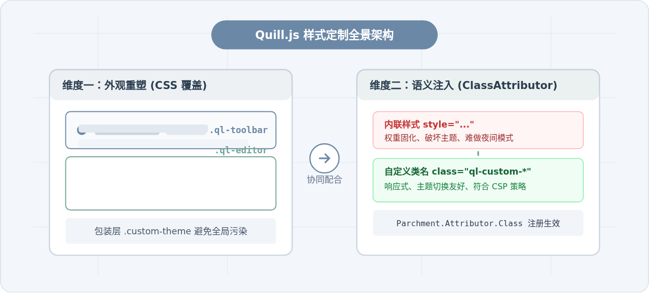
定制 Quill.js 的外观与内容排版,本质上由两个独立但紧密协作的环节构成:一是宿主层面的 CSS 样式覆盖,用于定制工具栏、边框、下拉菜单、占位符以及交互状态;二是编辑器数据层的 Parchment 格式重构,用于将原本散落的行内样式(如 style="color: red;")升级为具备高可维护性与语义化的自定义 CSS 类名(如 class="ql-color-warning")。本文将按照实际开发流程,完整拆解这两项操作的具体落地方案。
一、Quill.js DOM 层次解构与作用域策略
Quill 官方自带两套内置主题:snow(经典顶部工具栏模式)与 bubble(浮动气泡工具栏模式)。无论使用哪种主题,Quill 实例化后都会在宿主节点内部生成明确的层级结构。如果不了解这一层级而盲目修改样式,极易造成选择器权重不够或全局样式污染。
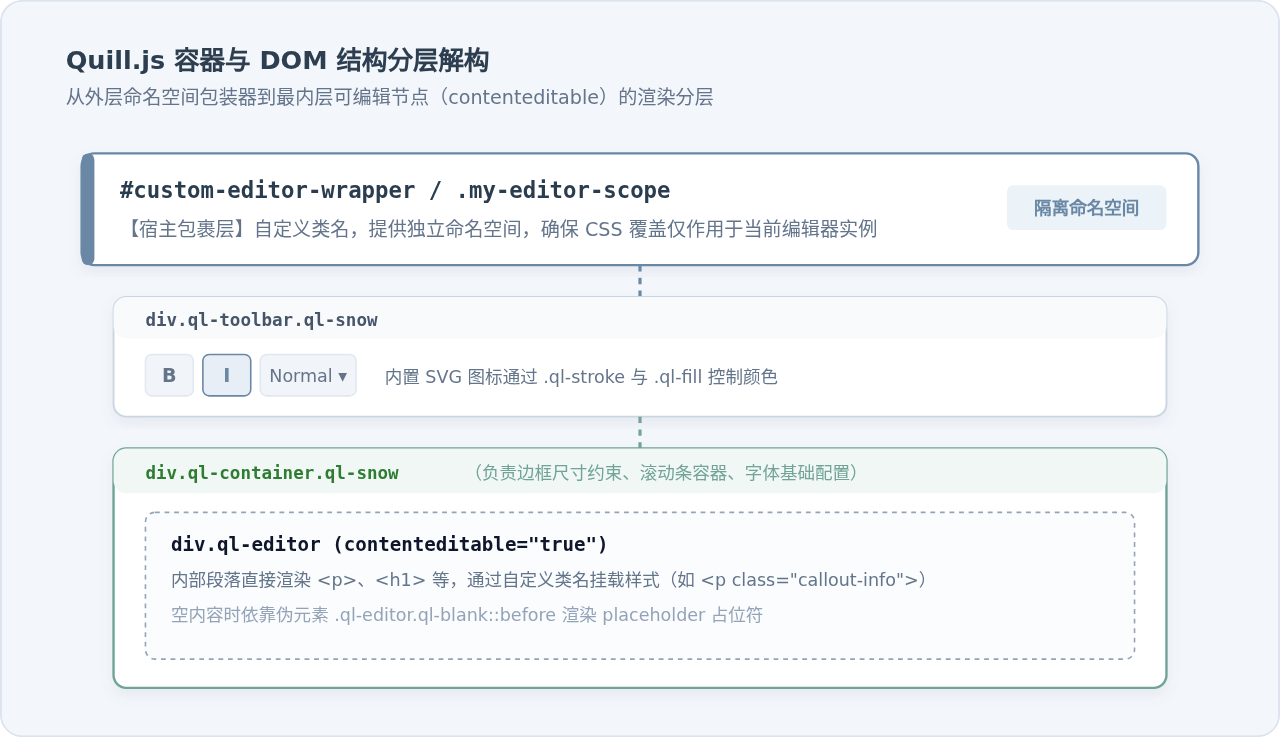
通常情况下,我们在页面中会按如下结构包裹编辑器:
<!-- 推荐:使用专用的包装类作为样式命名空间 -->
<div class="my-quill-theme">
  <div id="editor-container"></div>
</div>
当初始化 new Quill('#editor-container', { theme: 'snow' }) 之后,Quill 会在 #editor-container 上方插入兄弟节点 div.ql-toolbar.ql-snow,同时把 #editor-container 自身打上 class="ql-container ql-snow",其内部创建 div.ql-editor。
.ql-editor { ... } 或 .ql-toolbar { ... },会导致同一页面内的其他 Quill 实例或弹出弹窗受到波及。始终在最外层包裹自定义 class(如 .my-quill-theme),利用子代选择器进行限定。
二、实操步骤:通过 CSS 深度覆盖默认样式
Quill 默认主题给人的视觉印象较为生硬:双重直角线框、灰暗的 SVG 图标以及与现代 UI 框架格格不入的下拉菜单。遵循以下四步实施路径,可以规范地完成视觉重构。
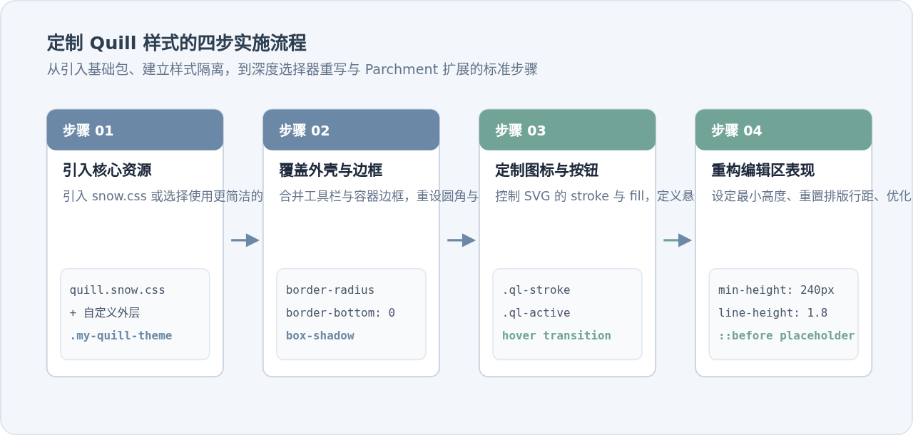
1. 边框一体化与外壳重塑
Quill 默认在 .ql-toolbar 底边和 .ql-container 顶边各自绘制了 1px solid #ccc,拼在一起会形成 2px 的重合厚边框。为了达到现代 UI 扁平一体化的质感,需要去掉工具栏下边框,并通过外层容器设置统一的圆角与投影:
/* 统一定义命名空间下的基础外壳 */
.my-quill-theme {
  border: 1px solid #dcdfe6;
  border-radius: 8px;
  overflow: hidden;
  background-color: #ffffff;
  transition: border-color 0.2s, box-shadow 0.2s;
}

/* 获得焦点或悬停时的交互动效 */
.my-quill-theme:focus-within {
  border-color: #6B88A6;
  box-shadow: 0 0 0 3px rgba(107, 136, 166, 0.15);
}

/* 消除原生的分割线与多重边框 */
.my-quill-theme .ql-toolbar.ql-snow {
  border: none;
  border-bottom: 1px solid #ebeef5;
  background-color: #f8fafc;
  padding: 8px 12px;
}

.my-quill-theme .ql-container.ql-snow {
  border: none;
  font-family: inherit;
}
2. 定制工具栏内置 SVG 图标着色
Quill 工具栏的图标全部直接以内联 SVG 输出。很多开发者尝试使用 color 属性修改图标颜色却发现毫无效果,这是因为图标矢量线条是通过专用类名 .ql-stroke(描边)与 .ql-fill(填充)控制的:
/* 默认状态下的图标描边与填充 */
.my-quill-theme .ql-snow .ql-stroke {
  stroke: #5a6a7e;
  stroke-width: 1.6;
  transition: stroke 0.2s;
}

.my-quill-theme .ql-snow .ql-fill {
  fill: #5a6a7e;
  transition: fill 0.2s;
}

/* 按钮悬停 (hover) 效果 */
.my-quill-theme .ql-snow.ql-toolbar button:hover .ql-stroke,
.my-quill-theme .ql-snow.ql-toolbar .ql-picker-label:hover .ql-stroke {
  stroke: #6B88A6;
}

.my-quill-theme .ql-snow.ql-toolbar button:hover .ql-fill,
.my-quill-theme .ql-snow.ql-toolbar .ql-picker-label:hover .ql-fill {
  fill: #6B88A6;
}

/* 按钮激活 (active) 状态:高亮并增加浅色背景 */
.my-quill-theme .ql-snow.ql-toolbar button.ql-active {
  background-color: #e8eef5;
  border-radius: 4px;
}

.my-quill-theme .ql-snow.ql-toolbar button.ql-active .ql-stroke {
  stroke: #2c3e50;
  stroke-width: 2;
}

.my-quill-theme .ql-snow.ql-toolbar button.ql-active .ql-fill {
  fill: #2c3e50;
}
3. 编辑区视口约束与 Placeholder 样式修正
如果不指定高度,.ql-editor 会随着内容无节制增长,或者初始高度只有一行。另外其原生 placeholder 默认带有斜体(font-style: italic),这在中文排版中通常需要重置为正常体:
/* 限制编辑区最小高度与内部排版 */
.my-quill-theme .ql-editor {
  min-height: 220px;
  max-height: 500px;
  overflow-y: auto;
  font-size: 15px;
  line-height: 1.8;
  color: #2c3e50;
  padding: 16px 20px;
}

/* 优化 Placeholder 占位符表现 */
.my-quill-theme .ql-editor.ql-blank::before {
  color: #94a3b8;
  font-style: normal;
  left: 20px;
  right: 20px;
}
三、核心进阶:使用 Parchment 注册自定义类名
修改 CSS 只能解决编辑器框架与已有格式的外观问题。然而在真实业务中,最关键的需求往往是:不要在富文本 HTML 中留下散乱的行内样式,而是生成标准可控的 CSS 类名。
1. 为什么必须转向 Class 机制?
Quill 默认的格式控制器(StyleAttributor)会直接将格式写入内联 style 属性。例如设置字体颜色为红色时,输出内容为 <span style="color: rgb(230, 0, 0);">文字</span>。
- 难以适配暗黑模式 / 换肤:写死十六进制色值的标签无法跟随系统主题动态自适应。
- CSP 限制:生产环境中严格的内容安全策略(Content Security Policy)通常禁止
unsafe-inline。 - 样式隔离与清洗难题:后台做 HTML Sanitizer(如 DOMPurify)清洗时,过滤内联样式非常繁琐,而验证类名白名单则极为高效安全。
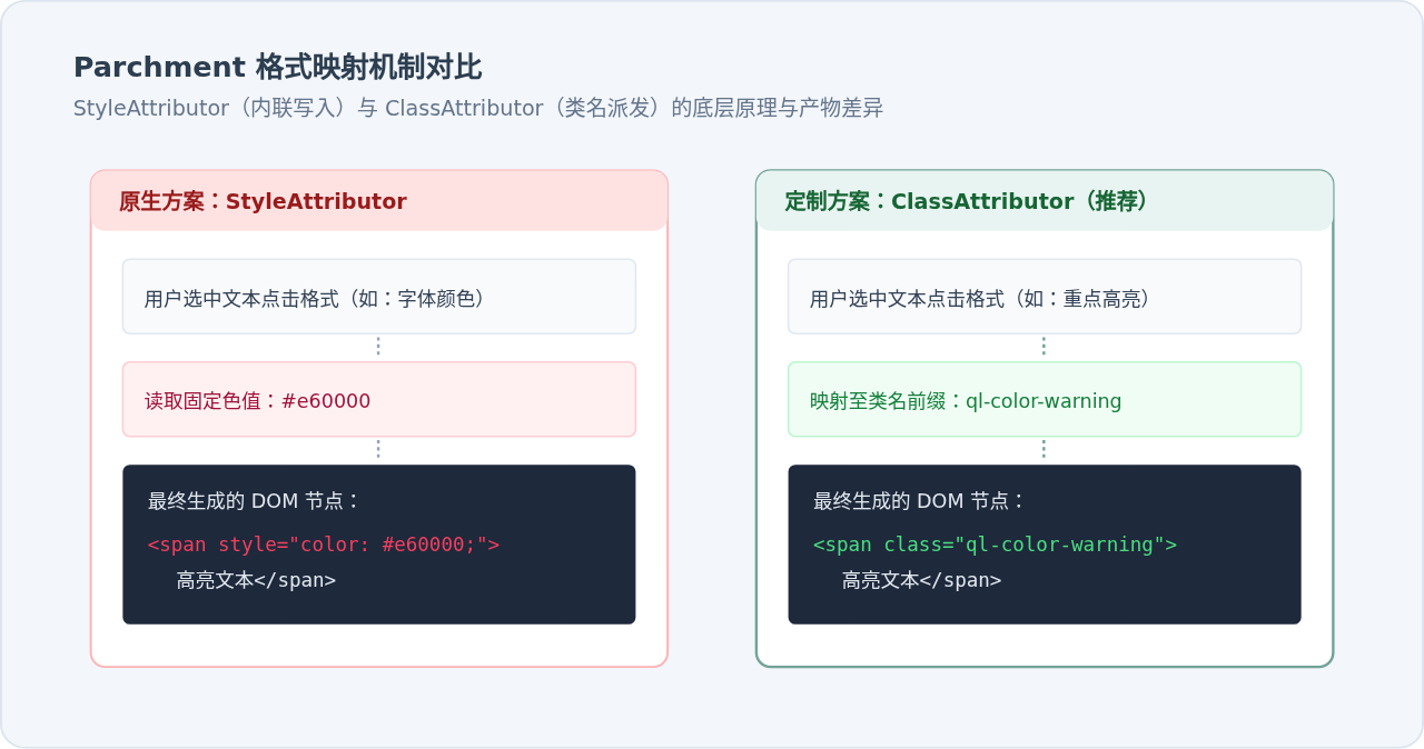
2. 激活 Quill 内置的类名格式器
Quill 内部其实预置了常见属性的 Class 版本。开发者不需要重写底层代码,只需在实例化前通过 Quill.register 进行重载替换:
// 引入内置的 Class Attributor
const AlignClass = Quill.import('attributors/class/align');
const BackgroundClass = Quill.import('attributors/class/background');
const ColorClass = Quill.import('attributors/class/color');
const DirectionClass = Quill.import('attributors/class/direction');
const FontClass = Quill.import('attributors/class/font');
const SizeClass = Quill.import('attributors/class/size');

// 关键步骤:使用 true 参数强制覆盖默认的内联 style 实现
Quill.register(AlignClass, true);
Quill.register(BackgroundClass, true);
Quill.register(ColorClass, true);
Quill.register(DirectionClass, true);
Quill.register(FontClass, true);
Quill.register(SizeClass, true);
配置完成后,当用户在工具栏设置文字大小为 large 时,生成的 HTML 不再是 style="font-size: 1.5em;",而是自动转化为标准类名 class="ql-size-large"。接着只需要在项目 CSS 中定义该类:
.ql-editor .ql-size-small { font-size: 0.75rem; }
.ql-editor .ql-size-large { font-size: 1.25rem; }
.ql-editor .ql-size-huge { font-size: 1.75rem; font-weight: 600; }

.ql-editor .ql-align-center { text-align: center; }
.ql-editor .ql-align-right { text-align: right; }
3. 自定义全新 ClassAttributor(以提示框 Callout 与文本高亮为例)
如果内置的格式无法满足产品需求(例如需要在编辑器中插入“信息提示块”或“成功提示块”),可以通过底层 Parchment 对象声明全新的 Attributor.Class。
// 1. 获取 Parchment 对象
const Parchment = Quill.import('parchment');

// 2. 创建一个块级(BLOCK Scope)的 ClassAttributor
// 参数依次为:格式名称 (attrName), 基础类名前缀 (keyName), 配置项 (options)
const CalloutClass = new Parchment.Attributor.Class('callout', 'callout', {
  scope: Parchment.Scope.BLOCK,
  whitelist: ['info', 'warning', 'success', 'danger']
});

// 3. 创建一个行内(INLINE Scope)的高亮类名 Attributor
const HighlightClass = new Parchment.Attributor.Class('highlight', 'hl', {
  scope: Parchment.Scope.INLINE,
  whitelist: ['blue', 'amber', 'emerald']
});

// 4. 将格式注册进 Quill 全局格式注册表
Quill.register(CalloutClass, true);
Quill.register(HighlightClass, true);
注册完成后,编写配套的 CSS 规则:
/* 行内高亮类名渲染 */
.ql-editor .hl-blue {
  background-color: #dbeafe;
  color: #1e40af;
  padding: 2px 6px;
  border-radius: 4px;
}
.ql-editor .hl-amber {
  background-color: #fef3c7;
  color: #92400e;
  padding: 2px 6px;
  border-radius: 4px;
}

/* 块级提示框 (Callout) 渲染 */
.ql-editor .callout-info {
  background-color: #eff6ff;
  border-left: 4px solid #3b82f6;
  padding: 12px 16px;
  margin: 12px 0;
  border-radius: 0 6px 6px 0;
}
.ql-editor .callout-warning {
  background-color: #fffbeb;
  border-left: 4px solid #f59e0b;
  padding: 12px 16px;
  margin: 12px 0;
  border-radius: 0 6px 6px 0;
}
4. 绑定工具栏按钮与触发调用
在初始化 Quill 时,通过配置工具栏或调用 API 来派发这些自定义类名:
// 初始化编辑器
const quill = new Quill('#editor-container', {
  theme: 'snow',
  modules: {
    toolbar: {
      container: [
        ['bold', 'italic'],
        [{ 'callout': ['info', 'warning', 'success', 'danger'] }], // 自定义下拉菜单
        ['clean']
      ],
      handlers: {
        // 自定义处理函数,也可以在此处弹窗交互后再格式化
        'callout': function(value) {
          this.quill.format('callout', value);
        }
      }
    }
  }
});

// 亦可在外部代码中通过 API 赋予格式:
// 将当前选区文字设为蓝色行内高亮
quill.format('highlight', 'blue');
四、方案对比与决策矩阵
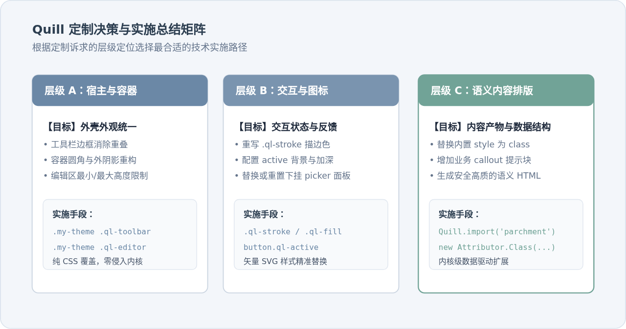
在实际项目中,面对不同的 UI 调整需求,应合理选择定制手段。下表总结了纯 CSS 覆盖与 ClassAttributor 的技术差异:
| 考量维度 | 纯 CSS 作用域覆盖 | Parchment ClassAttributor 扩展 |
|---|---|---|
| 生效范围 | 外层框架、工具栏、下拉浮层、光标、占位符 | 富文本内部节点(<p>、<span>、<blockquote> 等) |
| 侵入程度 | 零侵入,仅作用于展示层 | 深入编辑内核,会直接改变 Delta 格式与 HTML 产物 |
| CSP 安全策略 | 天然兼容,无安全阻碍 | 完全规避 unsafe-inline 风险,符合现代安全规范 |
| 多主题 / 暗黑模式 | 通过 CSS 变量或类名快速统一切换 | 正文内容格式完全与外观解耦,极易适配全局皮肤 |
| 适用场景 | 产品 UI 规范改版、工具栏图标美化、视口高度定制 | 业务自定义语义块(Callout、卡片标签、多色高亮标注) |
五、总结与注意事项
在完成 Quill.js 的样式深度定制后,还有以下三个关键细节需要在项目上线前进行核验:
-
回显页面的样式配套:使用
ClassAttributor产出的 HTML 带有ql-size-large或callout-info等类名。当这些富文本内容在其他页面或移动端仅以只读方式渲染时,必须同步引入对应的类名样式表,或者将包含类名样式的 CSS 作为公共模块加载,否则在阅读页面会导致样式丢失。 -
避免使用
!important破坏层级:通过添加父级包裹类.my-quill-theme已经足以提高选择器权重。过度使用!important会导致后续动态主题切换(如一键换肤)变得极其困难。 -
Quill 2.0 升级兼容性:在 Quill 2.x 版本中,Parchment 升级到了 2.x/3.x,部分 Attributor 的引用路径有所微调。如果使用打包工具(Webpack/Vite),请确保从
quill/core正确导出或通过Quill.import('parchment')获取,确保格式注册优先于编辑器实例创建。
JS中parseInt与Number转整数的核心区别及适用场景
2026-11-05 17:35:53
混淆JS代码怎么在线反混淆并格式化阅读
2026-11-03 21:46:39
JS在线编辑器代码报错怎么调试?控制台使用技巧
2026-11-03 21:24:56
从 marked.js 旧版本升级到最新版:API 变更与迁移指南
2026-11-03 17:38:17
JS富文本编辑器Quill与代码编辑器CodeMirror的区别及应用场景
2026-11-03 16:52:09
相关标签: