
结合 CSS 动画与 JavaScript 控制实现高性能动态背景
深入解析如何利用 CSS 硬件加速合成器承载持续视觉运动,配合 JavaScript 节流调度 CSS 自定义属性,实现兼具交互感知与 60/120 FPS 高帧率的现代网页动态背景方案。
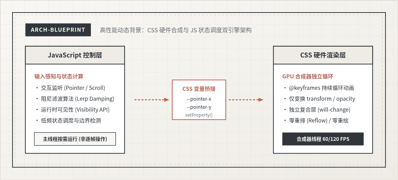
一、为什么传统纯 JS 驱动会导致背景卡顿
在早期的动态背景设计中,开发者习惯在 JavaScript 的 requestAnimationFrame 循环或 mousemove 监听函数中,遍历数十个光斑、几何块或粒子元素,直接修改其 style.left、style.top 或 style.width。这种全 JS 驱动方案存在根本性的性能瓶颈。
现代浏览器的渲染流水线分为五个主要阶段:JavaScript 执行 ➔ 样式计算(Recalculate Style)➔ 布局重排(Layout/Reflow)➔ 绘制重绘(Paint)➔ 图层合成(Composite)。当我们在主线程频繁修改几何布局属性时,浏览器必须在每一帧重新计算文档流并重绘像素。一旦页面中同时存在复杂的 DOM 树、富文本或正在执行的数据处理,主线程就会发生排队阻塞,导致动态背景出现明显的掉帧与卡顿。
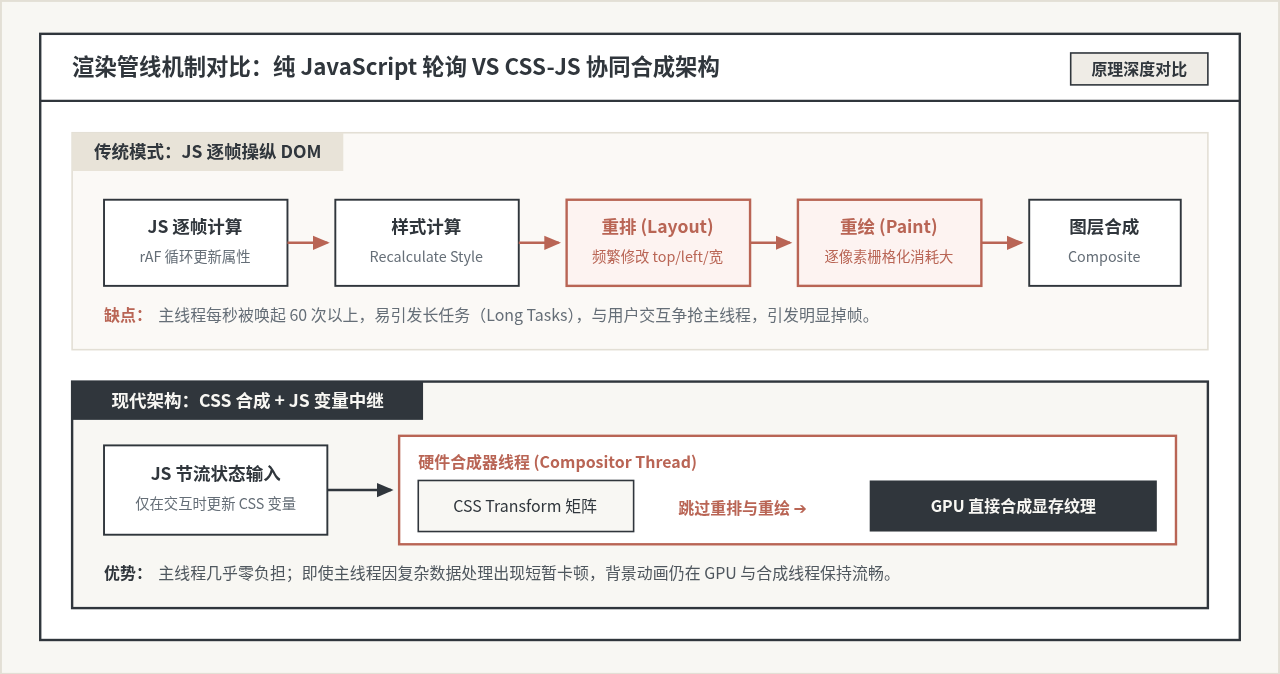
相比之下,现代浏览器提供了独立的合成器线程(Compositor Thread)。当一个元素被提升为独立的合成层,且仅对其应用 transform 和 opacity 属性的变化时,动画可以直接在 GPU 显存中完成图层位移、缩放与渐变合成,彻底绕过重排(Layout)与重绘(Paint)。即便主线程被繁重的业务逻辑阻塞数毫秒,背景层依然能在合成线程中平稳保持 60 或 120 FPS 的顺畅输出。
二、协同工作模型:以 CSS 自定义属性为中继站
完全由纯 CSS 驱动的背景虽然性能优异,却失去了对外部环境的感知能力——它无法感知鼠标指针的位置、视口滚动的距离,也无法根据网络状态或电池电量动态调节运动剧烈程度。我们需要让 JavaScript 参与进来,但绝不能让它逐帧接管渲染。
最佳的工程解法是“CSS 负责帧动画,JS 负责参数注入”:
- CSS 声明层:在 CSS 内部使用
@keyframes定义自包含的、持续运行的基础运动轨迹(例如径向渐变光斑的周期性呼吸与圆周漂移)。在运动公式中,引入形如var(--mouse-x, 0px)与var(--mouse-y, 0px)的 CSS 变量作为偏移增量。 - JS 控制层:JavaScript 不去直接触碰几十个子元素的几何属性,而是仅仅监听用户的鼠标滑动或滚动事件。经过阻尼滤波与
requestAnimationFrame节流对齐后,仅对背景容器根节点执行一次container.style.setProperty('--mouse-x', `${val}px`)。
这一设计将原本每秒数百次的 DOM 节点深层修改,收敛为极低频率的根变量更新,所有层内子元素由浏览器内部自动进行批量响应,消除了由于 JS 频繁回流引发的性能劣势。
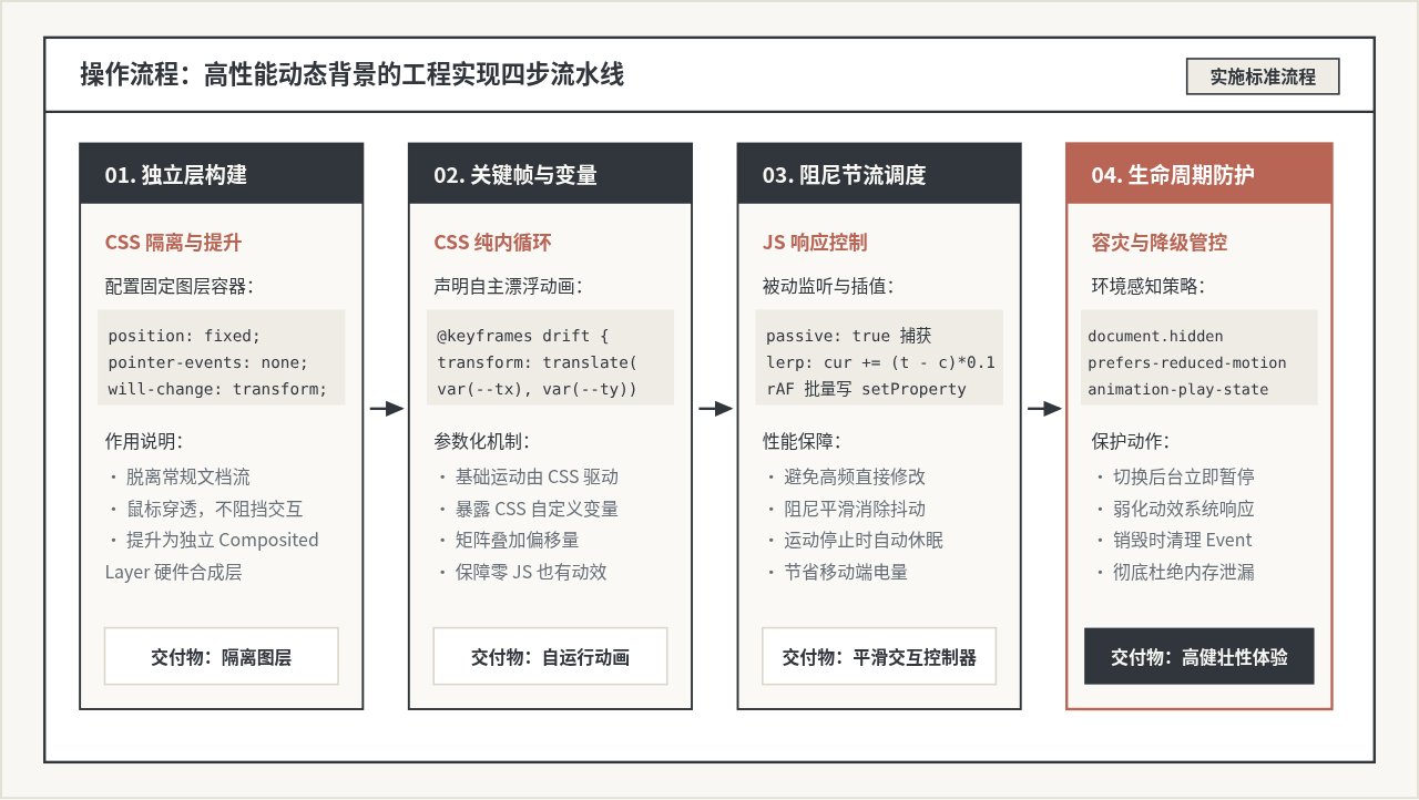
三、端到端完整工程实现示例
下面是一个标准的交互式双光斑流动背景实现,包含完整的 HTML 标记、CSS 独立图层设置以及带有平滑阻尼因子的 JavaScript 控制器。
1. HTML 结构设计
动态背景容器应严格从常规文档流中抽离,并通过 pointer-events: none 避免拦截底层任何按钮与链接的点击事件:
<!-- 背景容器:pointer-events 穿透,避免遮挡页面交互 -->
<div class="ambient-background" id="ambientBg" aria-hidden="true">
  <div class="glow-orb orb-primary"></div>
  <div class="glow-orb orb-secondary"></div>
  <div class="ambient-grid-overlay"></div>
</div>
2. CSS 硬件加速与关键帧配置
在样式层,通过 position: fixed 和 will-change: transform 将容器提升为独立合成层。光斑使用静态的 radial-gradient 预渲染,在 @keyframes 动画中只变换 transform 矩阵:
/* 根容器隔离与参数预设 */
.ambient-background {
  position: fixed;
  top: 0;
  left: 0;
  width: 100vw;
  height: 100vh;
  z-index: -1;
  overflow: hidden;
  pointer-events: none;
  background-color: #F8F7F3;
  /* 供 JS 注入的交互参数 */
  --pointer-x: 0px;
  --pointer-y: 0px;
  /* 强制提升为 GPU 独立复合层 */
  will-change: transform;
}

/* 静态网格遮罩,提供几何质感 */
.ambient-grid-overlay {
  position: absolute;
  inset: 0;
  background-image:
    linear-gradient(to right, rgba(48, 54, 60, 0.05) 1px, transparent 1px),
    linear-gradient(to bottom, rgba(48, 54, 60, 0.05) 1px, transparent 1px);
  background-size: 32px 32px;
}

/* 光斑基础样式:采用 transform3d 触发 GPU 栅格化缓存 */
.glow-orb {
  position: absolute;
  border-radius: 50%;
  filter: blur(60px); /* 预先模糊,避免在关键帧中动态变换 blur 半径 */
  transform: translate3d(0, 0, 0);
}

/* 主光斑:微暖米色基底与炭灰扩散 */
.orb-primary {
  width: 480px;
  height: 480px;
  top: 20%;
  left: 25%;
  background: radial-gradient(circle, rgba(185, 101, 85, 0.28) 0%, rgba(248, 247, 243, 0) 70%);
  animation: orbitPrimary 18s cubic-bezier(0.45, 0.05, 0.55, 0.95) infinite alternate;
}

/* 副光斑:炭灰色调与反向位移 */
.orb-secondary {
  width: 560px;
  height: 560px;
  bottom: 15%;
  right: 20%;
  background: radial-gradient(circle, rgba(48, 54, 60, 0.18) 0%, rgba(248, 247, 243, 0) 70%);
  animation: orbitSecondary 24s ease-in-out infinite alternate;
}

/* 关键帧:纯 CSS 周期浮动 + 叠加由 JS 传入的微位移 */
@keyframes orbitPrimary {
  0% {
    transform: translate3d(var(--pointer-x), var(--pointer-y), 0) scale(1);
  }
  50% {
    transform: translate3d(calc(var(--pointer-x) + 60px), calc(var(--pointer-y) - 40px), 0) scale(1.08);
  }
  100% {
    transform: translate3d(calc(var(--pointer-x) - 40px), calc(var(--pointer-y) + 70px), 0) scale(0.95);
  }
}

@keyframes orbitSecondary {
  0% {
    transform: translate3d(calc(var(--pointer-x) * -0.6), calc(var(--pointer-y) * -0.6), 0) scale(1);
  }
  100% {
    transform: translate3d(calc(var(--pointer-x) * -0.6 - 70px), calc(var(--pointer-y) * -0.6 + 50px), 0) scale(1.12);
  }
}

/* 尊重用户的系统级无障碍减弱动效偏好 */
@media (prefers-reduced-motion: reduce) {
  .glow-orb {
    animation: none !important;
    transform: none !important;
  }
}
3. JavaScript 阻尼节流调度器
JavaScript 端的核心工作是捕获指针移动并以线性插值(Linear Interpolation, Lerp)算法平滑过渡坐标,保证鼠标骤停时背景仍然具有高雅的物理阻尼惯性:
class AmbientController {
  constructor(containerId) {
    this.container = document.getElementById(containerId);
    if (!this.container) return;

    // 目标坐标与当前插值坐标
    this.targetX = 0;
    this.targetY = 0;
    this.currentX = 0;
    this.currentY = 0;

    this.ease = 0.075; // 阻尼系数:越小惯性越明显
    this.rafId = null;
    this.isActive = false;

    // 绑定上下文
    this.onPointerMove = this.onPointerMove.bind(this);
    this.updateLoop = this.updateLoop.bind(this);
    this.onVisibilityChange = this.onVisibilityChange.bind(this);

    this.init();
  }

  init() {
    // 被动监听指针移动(支持鼠标与触控指针)
    window.addEventListener('pointermove', this.onPointerMove, { passive: true });
    // 页面可见性感知,离开标签页时挂起
    document.addEventListener('visibilitychange', this.onVisibilityChange);
  }

  onPointerMove(e) {
    // 将指针坐标转化为相对于窗口中心的偏移行程(限制最大幅度在 ±80px 内)
    const centerX = window.innerWidth / 2;
    const centerY = window.innerHeight / 2;
    const maxOffset = 80;

    this.targetX = ((e.clientX - centerX) / centerX) * maxOffset;
    this.targetY = ((e.clientY - centerY) / centerY) * maxOffset;

    // 仅在运动时启动 rAF,避免常驻轮询耗电
    if (!this.isActive) {
      this.isActive = true;
      this.rafId = requestAnimationFrame(this.updateLoop);
    }
  }

  updateLoop() {
    // 阻尼公式:current = current + (target - current) * ease
    const dx = this.targetX - this.currentX;
    const dy = this.targetY - this.currentY;

    this.currentX += dx * this.ease;
    this.currentY += dy * this.ease;

    // 批量将状态写入容器的 CSS 自定义属性
    this.container.style.setProperty('--pointer-x', `${this.currentX.toFixed(2)}px`);
    this.container.style.setProperty('--pointer-y', `${this.currentY.toFixed(2)}px`);

    // 当位移误差极其微弱时休眠 rAF,节省能耗
    if (Math.abs(dx) < 0.05 && Math.abs(dy) < 0.05) {
      this.currentX = this.targetX;
      this.currentY = this.targetY;
      this.isActive = false;
      this.rafId = null;
      return;
    }

    this.rafId = requestAnimationFrame(this.updateLoop);
  }

  onVisibilityChange() {
    if (document.hidden) {
      // 标签页退至后台:取消计算并暂停 CSS 关键帧
      if (this.rafId) cancelAnimationFrame(this.rafId);
      this.isActive = false;
      this.container.style.animationPlayState = 'paused';
    } else {
      this.container.style.animationPlayState = 'running';
    }
  }

  destroy() {
    if (this.rafId) cancelAnimationFrame(this.rafId);
    window.removeEventListener('pointermove', this.onPointerMove);
    document.removeEventListener('visibilitychange', this.onVisibilityChange);
  }
}

// 实例化运行
document.addEventListener('DOMContentLoaded', () => {
  window.ambientBackground = new AmbientController('ambientBg');
});
四、关键细节与性能边界防范
虽然上述架构将大部分渲染开销转移到了 GPU,但在生产环境中仍须遵循明确的边界原则,防止由于错误配置导致性能劣化。
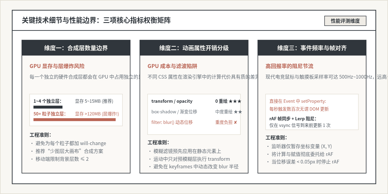
1. 警惕“合成层爆炸(Layer Explosion)”
很多开发者误认为“给所有元素加上 will-change: transform 能让页面变快”,这是常见的误区。在 Chrome 等现代渲染引擎中,每个独立的合成层都会在 GPU 显存内开辟单独的位图缓冲区。对于 1080P 分辨率的屏幕,一个带 Alpha 通道的全屏图层约占 8MB~16MB 显存。若对上百个小粒子元素分别声明独立复合层,瞬间会导致上百兆显存占用,引发移动端 Safari 崩溃或严重卡顿。因此,动态背景的独立层数量应严格控制在 2~4 个以内,大量细碎图形应集成在同一个父级图层中。
2. 避免在关键帧中直接动画高开销滤镜
filter: blur(30px) 是打造弥散光斑的经典属性,但千万不要在 @keyframes 中让 blur 半径从 10px 动画到 50px。动态调整高斯模糊半径属于昂贵的 GPU 像素着色器重复计算,每帧都会重新光栅化纹理。正确的做法是:给元素赋予固定的 blur 半径,并在关键帧中仅仅改变其 transform 矩阵或 opacity,因为平移和淡入淡出是经过硬件深度优化的低开销操作。
3. 事件监听器的 passive: true 必不可少
在绑定 pointermove 或 scroll 时,必须传递 { passive: true } 配置项。这明确通知浏览器内核:该监听函数绝不会调用 e.preventDefault(),从而允许浏览器在处理原生触摸滚动时不必等待 JS 执行完毕,确保页面滚动帧率与动态背景计算完全互不干扰。
五、异常处理、无障碍与降级策略
一个成熟的工业级动态背景必须兼顾多种边界条件与特殊运行环境:
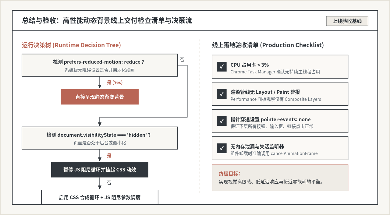
- 尊重系统减弱动画偏好:前庭功能障碍或眩晕症用户常在操作系统开启“减弱动态效果(Reduce Motion)”。通过 CSS 媒体查询
@media (prefers-reduced-motion: reduce),应直接停用所有@keyframes旋转与平移,仅显示柔和的静态渐变底色。 - 后台休眠与节能响应:借助
Page Visibility API,当用户最小化窗口或切换至其他浏览器标签页时,背景控制器必须主动取消requestAnimationFrame并在 CSS 层应用animation-play-state: paused,避免无意义的后台耗电。 - 弱网与离线容灾:背景应完全基于原生 CSS 与内联 SVG 或几何渐变构建,不依赖体积庞大的 WebGL 库(如 Three.js、PIXI.js)或外部高分辨率视频文件,从而保障在弱网环境下实现零秒首屏即刻加载。
六、工程落地总结与自查基线
结合 CSS 动画与 JavaScript 交互控制的核心哲学是“分工明确、各司其职”:
- CSS 专注于视觉表现:利用独立复合层与
transform变换,将高频连贯的动效彻底释放到 GPU 合成器线程执行。 - JavaScript 专注于参数协调:以被动监听与阻尼节流的形式计算状态,仅在必要时通过 CSS 自定义属性注入变量,并在静止状态下自动休眠。
- 严格的生产验收:在上线前打开 Chrome DevTools 的 Performance 与 Rendering 面板,开启 Paint Flashing(重绘闪烁检测)。如果在光斑游走与鼠标交互过程中没有任何全屏绿色高亮重绘,且 CPU 占用率稳定在 3% 以下,即可确认该动态背景已达到高水准的高性能交付要求。
JS使用classList动态切换类名替代直接修改style
2026-11-19 09:46:52
JavaScript怎么获取页面或元素的当前滚动高度
2026-11-19 08:42:05
JS怎么通过appendChild移动元素改变其父节点
2026-11-18 22:58:08
JS怎么在指定位置插入DOM:insertBefore与insertAdjacentHTML详解
2026-11-18 20:40:27
JS获取DOM元素的5种常用方法详解
2026-11-18 18:39:04