

JavaScript 实现简单随机 3D 骰子动画
作者:窗边听雨时间:2026-10-23 12:19:51浏览:505
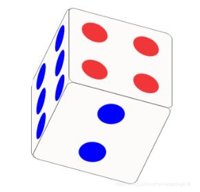
本文介绍如何使用 HTML、CSS3 和 JavaScript 实现一个简单的随机 3D 骰子效果。通过 CSS3 的 transform 属性构建立方体结构,利用关键帧动画模拟投掷过程,并结合 JS 计算最终随机点数与旋转角度的对应关系,完整展示前端交互逻辑与代码实现。
JS 3D 骰子实现概述
本文分享了一个使用 JavaScript 实现的简单随机 3D 骰子示例,供读者参考学习。
功能描述:
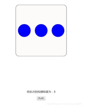
该示例旨在通过 JavaScript 实现一个具备随机结果的 3D 骰子交互效果。
效果展示:
代码实现详解
实现原理与步骤如下:
HTML 结构部分:
HTML 结构构建
<!DOCTYPE html>
<html lang="en">

<head>
 <meta charset="UTF-8">
 <meta name="viewport" content="width=device-width, initial-scale=1.0">
 <meta http-equiv="X-UA-Compatible" content="ie=edge">
 <title>Document</title>
</head>
<link rel="stylesheet" href="css/T1.css" >

<body>
 <div class="dice">
  <div class="face">
   <div class="item1"></div>
  </div>
  <div class="face">
   <div class="item2"></div>
   <div class="item2"></div>
  </div>
  <div class="face">
   <div class="item3"></div>
   <div class="item3"></div>
   <div class="item3"></div>
  </div>
  <div class="face">
   <div class="face_0">
    <div class="item4"></div>
    <div class="item4"></div>
   </div>
   <div class="face_0">
    <div class="item4"></div>
    <div class="item4"></div>
   </div>
  </div>
  <div class="face">
   <div class="face_0">
    <div class="item5"></div>
    <div class="item5"></div>
   </div>
   <div class="face_0">
    <div class="item5"></div>
   </div>
   <div class="face_0">
    <div class="item5"></div>
    <div class="item5"></div>
   </div>
  </div>
  <div class="face">
   <div class="face_0">
    <div class="item6"></div>
    <div class="item6"></div>
   </div>
   <div class="face_0">
    <div class="item6"></div>
    <div class="item6"></div>
   </div>
   <div class="face_0">
    <div class="item6"></div>
    <div class="item6"></div>
   </div>
  </div>
 </div>

 <p class="view"></p>

 <p>
  <button id="play">PLAY</button>
 </p>
</body>
<script src="js/T1.js"></script>

</html>
CSS 样式部分:
CSS3 动画与样式
@keyframes rotate {
 to {
  transform: rotateX(360deg) rotateY(360deg);
 }
}

@keyframes domo{
 20%{
  transform: rotateX(20deg);
 }
 60%{
  transform: rotateX(20deg) rotateY(200deg);
 }
 100%{
  transform: rotateX(100deg) rotateY(1000deg) rotateZ(-100deg);
 }
}


.dice {
 width: 300px;
 height: 300px;
 margin: 100px auto 200px;
 position: relative;
 transform-style: preserve-3d;
 /* animation: rotate 2s; */
 animation-duration: 3s;
 animation-timing-function: linear;
 transition: all 1s;
}

.dice:hover{
 animation: domo 5s linear 0s infinite alternate;
}

.dice .face {
 width: 100%;
 height: 100%;
 display: flex;
 position: absolute;
 left: 0;
 top: 0;
 border: 1px solid #000;
 background: rgb(253, 250, 250);
 border-radius: 20px;
 font-size: 100px;
 color: #fff;
 line-height: 300px;
 text-align: center;
}

.item1{
 width: 100px;
 height: 100px;
 background: red;
 border-radius: 50%;
}

.item2{
 width: 75px;
 height: 75px;
 background: blue;
 border-radius: 50%;
}

.item3{
 width: 75px;
 height: 75px;
 background: blue;
 border-radius: 50%;
}

.item4{
 width: 75px;
 height: 75px;
 background: rgb(240, 54, 54);
 border-radius: 50%;
}

.item5{
 width: 75px;
 height: 75px;
 background: blue;
 border-radius: 50%;
}

.item6{
 width: 75px;
 height: 75px;
 background: blue;
 border-radius: 50%;
}

.face:nth-child(1) {
 justify-content: center;
 align-items: center;
 transform: translateZ(150px);
}

.face:nth-child(2) {
 justify-content: space-around;
 align-items: center;
 transform: rotateX(-90deg) translateZ(150px);
}

.face:nth-child(3) {
 justify-content: space-around;
 align-items: center;
 flex-wrap: wrap;
 transform: rotateY(90deg) translateZ(150px);
}

.face:nth-child(4) {
 flex-wrap: wrap;
 justify-content: center;
 align-items: center;
 transform: rotateY(-90deg) translateZ(150px);
}

.face:nth-child(4) .face_0{
 width: 300px;
 height: 75px;
 display: flex;
 justify-content: space-around;
}

.face:nth-child(5) {
 flex-wrap: wrap;
 justify-content: center;
 align-items: center;
 transform: rotateX(90deg) translateZ(150px);
}

.face:nth-child(5) .face_0{
 width: 300px;
 height: 75px;
 display: flex;
 justify-content: space-around;
}

.face:nth-child(6) {
 flex-wrap: wrap;
 justify-content: center;
 align-items: center;
 transform: translateZ(-150px);
}

.face:nth-child(6) .face_0{
 width: 300px;
 height: 75px;
 display: flex;
 justify-content: space-around;
}

p {
 text-align: center;
}
JavaScript 逻辑部分:
JavaScript 交互逻辑
(function () {

 let odice = document.querySelector('.dice')
 let oview = document.querySelector('.view')
 let oplay = document.querySelector('#play') // 按钮
 oplay.onclick = playTheGame

 // 当骰子动画执行后
 odice.addEventListener('webkitAnimationEnd', () => {
  odice.style.animationName = 'none' // 更改动画属性,以待下一次动画的正常执行
  // 可能出现的情况集合
  let _posible = [
   { value: 1, x: 0, y: 0 },
   { value: 6, x: 0, y: 180 },
   { value: 3, x: 0, y: -90 },
   { value: 4, x: 0, y: 90 },
   { value: 5, x: -90, y: 0 },
   { value: 2, x: 90, y: 0 },
  ]
  // 准备抽取的随机数
  let _random = Math.floor(Math.random() * 6)
  // 抽取的随机结果
  let _result = _posible[_random]
  setTimeout(() => { // 浏览器反应不过来加过渡
   // 让骰子旋转到正确的角度
   odice.style.transform = `
    rotateX(${ _result.x }deg) rotateY(${ _result.y }deg)
   `
   renderView(_result.value) // 渲染视图
  }, 0);

 })

 function playTheGame() { // 游戏方法
  // 骰子转起来

  // 有的时候浏览器在连续使用js操作css的时候会出现问题(反应不过来),比如,效果不能正常显示,此时可以尝试利用setTimeout-0来将目标代码放入到异步队列中等待执行
  // setTimeout(() => {
   odice.style.animationName = 'rotate'
  // }, 0);
 }


 function renderView(result) { // 渲染结果到页面视图
  oview.innerHTML = '您此次的投掷结果为:' + result
 }

})();
以上就是本文关于 JS 实现简单随机 3D 骰子的全部内容,希望能为读者提供有价值的参考。
作者最新文章
anime.js 快速入门:怎么引入库并编写第一个 DOM 动画
2026-11-05 14:22:43
在线JS解密后变量名仍乱码?结合浏览器DevTools调试还原
2026-11-04 20:26:01
怎么在浏览器中运行JavaScript代码并查看输出结果
2026-11-04 09:07:33
JS 获取屏幕分辨率:window.screen.width 与 height 用法
2026-11-04 08:52:48
为什么推荐用DOMContentLoaded代替window.onload初始化JS
2026-11-04 08:42:33