

精选9款主流JavaScript图表库:Chart.js、Echarts与Recharts等详解
本文详细解析了9款主流的JavaScript图表库,包括Chart.js、Chartist、FlexChart、Echarts、NVD3、C3.js、TauCharts、Recharts和Flot。内容涵盖各库的核心特性、适用场景、安装方式及代码示例,帮助前端开发者根据项目需求选择合适的数据可视化工具,提升Web应用的数据展示能力。
数据可视化与 JavaScript 图表库概述
在当前的数据科学领域,数据可视化占据着至关重要的地位。来自不同网络系统的数据,必须经过恰当的可视化处理,才能更清晰地向用户呈现,从而便于读取与分析。
对于任何组织而言,若能充分获取、可视化并分析数据,将极大程度地助力理解数据背后的深层原因,进而据此做出正确的决策。
对于前端开发人员来说,掌握交互式网页中的数据可视化技术是一项极具价值的技能。借助各类 JavaScript 图表库,前端数据可视化工作变得更为简便。使用这些库,开发者无需纠结于不同语法带来的编程难题,即可轻松将数据转化为直观易懂的图表。
以下是经过筛选的 9 个 JavaScript 图表库:
Chart.js、Chartist、FlexChart、Echarts、NVD3、C3.js、TauCharts、ReCharts、Flot
Chart.js:简洁友好的 HTML5 图表库
Chart.js
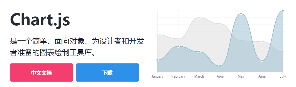
Chart.js 是一款简洁且用户友好的图表库,它基于 HTML5 和 JavaScript 构建,旨在创建具有动画效果、交互性及可自定义功能的图表和图形。
借助 Chart.js,用户可以轻松直观地查看混合图表类型。此外,Chart.js 默认支持创建响应式网页。
Chart.js 库允许用户快速创建数据可视化内容。其设置简单,对初学者十分友好。由于 Chart.js 支持旧版浏览器,因此无需考虑浏览器兼容性问题。
使用 npm 安装 Chart.js 的命令如下:
npm install chart.js --save
以下是使用 Chart.js 绘制雷达图的代码示例:
const ctx = document.getElementById("myChart");
const options = {
 scale: {
 // Hides the scale
 }
};
const data = {
 labels: ['Running', 'Swimming', 'Eating', 'Cycling'],
 datasets: [
       {
  data: [-10, -5, -3, -15],
  label: "two",
  borderColor: '#ffc63b'
  },
      {
  data: [10, 5, 3, 10],
  label: "three",
  borderColor: '#1d9a58'
  },
  {
 data: [18, 10, 4, 2],
 label: "one",
 borderColor: '#d8463c'
 },
]
}

const myRadarChart = new Chart(ctx, {
 data: data,
 type: 'radar',
 options: options
});
Chartist:基于 SVG 的响应式图表库
Chartist

Chartist 库非常适合创建美观、响应能力强且阅读友好的图表。该库使用 SVG 来呈现图表。
Chartist 还提供了利用 CSS 媒体查询和创意动画来自定义图表的能力。用户可以使用 Chartist 在图表设计中实现各种创意构想。
Chartist 易于配置,也支持通过 Sass 进行定制。需要注意的是,它不支持旧版浏览器。
使用 Chartist,用户可以通过 CSS 样式美化 SVG,完全实现心中设想的图表样式。
使用 npm 安装 Chartist 的命令如下:
npm install chartist --save
以下是使用 Chartist 创建带有自定义标签的饼图的代码示例:
var data = {
 labels: ['Bananas', 'Apples', 'Grapes'],
 series: [20, 15, 40]
};
var options = {
 labelInterpolationFnc: function(value) {
 return value[0]
 }
};
var responsiveOptions = [
 ['screen and (min-width: 640px)', {
 chartPadding: 30,
 labelOffset: 130,
 labelDirection: 'explode',
 labelInterpolationFnc: function(value) {
 return value;
 }
 }],
 ['screen and (min-width: 1024px)', {
 labelOffset: 80,
 chartPadding: 20
 }]
];
new Chartist.Pie('.ct-chart', data, options, responsiveOptions);
FlexChart:高性能业务图表工具
FlexChart
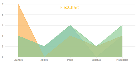
FlexChart 是一款高性能的图表工具。使用 FlexChart,可以轻松将表格数据可视化为业务图表。它不仅支持折线图、饼状图、面积图等常见图表类型,还支持气泡图、K线图、条形图、漏斗图等高级图表类型。
FlexChart 的使用十分简单,它将所有与数据相关的任务委托给 CollectionView 类。只需操作 CollectionView 类,即可实现过滤、排序和分组数据等功能。
FlexChart 包含的图表元素较为全面,如图表图例、图表标题、图表页脚、数轴、图表 series 和标签等。用户还可以为图表添加自定义元素,例如平均线和趋势线等。
FlexChart 本质上是一种交互式图表,无论数据发生何种更改,都会自动反映在图表上,例如图表曲线随数据放大缩小、过滤、钻取及动画效果等。
可查看 FlexChart 的中文学习指南和旭日图 Demo。
以下是使用 FlexChart 绘制柱状图的代码示例:
onload = function() {
 // wrap data in a CollectionView so the grid and chart
 // get notifications
 var data = new wijmo.collections.CollectionView(getData());
 // create the chart
 var theChart = new wijmo.chart.FlexChart('#theChart', {
 itemsSource: data,
 bindingX: 'country',
 series: [
 { binding: 'sales', name: 'Sales' },
 { binding: 'expenses', name: 'Expenses' },
 { binding: 'downloads', name: 'Downloads' }
 ]
 })
 // create a grid to show the data
 var theGrid = new wijmo.grid.FlexGrid('#theGrid', {
 itemsSource: data
 })
 // create some random data
 function getData() {
 var countries = 'US,Germany,UK,Japan,Italy,Greece'.split(','),
 data = [];
 for (var i = 0; i < countries.length; i++) {
 data.push({
  country: countries[i],
  sales: Math.random() * 10000,
  expenses: Math.random() * 5000,
  downloads: Math.round(Math.random() * 20000),
 });
 }
 return data;
 }
}
Echarts:功能丰富的数据可视化库
Echarts
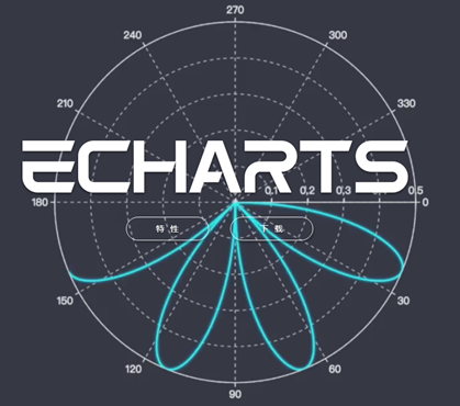
Echarts 是网页数据可视化领域一个非常有用的库。使用 Echarts,开发者可以创建直观、可自定义的交互式图表,使数据的展示和分析变得十分容易。
由于 Echarts 是用普通 JavaScript 编写的,因此不存在其他图表库可能遇到的无法无缝迁移的问题。
同时,Echarts 提供了大量官方文档供用户查阅。
使用 npm 可以很容易地完成 Echarts 的安装:
npm install echarts --save
以下是使用 Echarts 绘制散点图的代码示例:
var dom = document.getElementById("container");
var myChart = echarts.init(dom);
var app = {};
option = null;
option = {
 title: {
 text: 'Large-scale scatterplot'
 },
 tooltip : {
 trigger: 'axis',
 showDelay : 0,
 axisPointer:{
  show: true,
  type : 'cross',
  lineStyle: {
  type : 'dashed',
  width : 1
  }
 },
 zlevel: 1
 },
 legend: {
 data:['sin','cos']
 },
 toolbox: {
 show : true,
 feature : {
  mark : {show: true},
  dataZoom : {show: true},
  dataView : {show: true, readOnly: false},
  restore : {show: true},
  saveAsImage : {show: true}
 }
 },
 xAxis : [
 {
  type : 'value',
  scale:true
 }
 ],
 yAxis : [
 {
  type : 'value',
  scale:true
 }
 ],
 series : [
 {
  name:'sin',
  type:'scatter',
  large: true,
  symbolSize: 3,
  data: (function () {
  var d = [];
  var len = 10000;
  var x = 0;
  while (len--) {
   x = (Math.random() * 10).toFixed(3) - 0;
   d.push([
   x,
   //Math.random() * 10
   (Math.sin(x) - x * (len % 2 ? 0.1 : -0.1) * Math.random()).toFixed(3) - 0
   ]);
  }
  //console.log(d)
  return d;
  })()
 },
 {
  name:'cos',
  type:'scatter',
  large: true,
  symbolSize: 2,
  data: (function () {
  var d = [];
  var len = 20000;
  var x = 0;
  while (len--) {
   x = (Math.random() * 10).toFixed(3) - 0;
   d.push([
   x,
   //Math.random() * 10
   (Math.cos(x) - x * (len % 2 ? 0.1 : -0.1) * Math.random()).toFixed(3) - 0
   ]);
  }
  //console.log(d)
  return d;
  })()
 }
 ]
};
;
if (option && typeof option === "object") {
 myChart.setOption(option, true);
}
NVD3:基于 D3 的强大图表库
NVD3
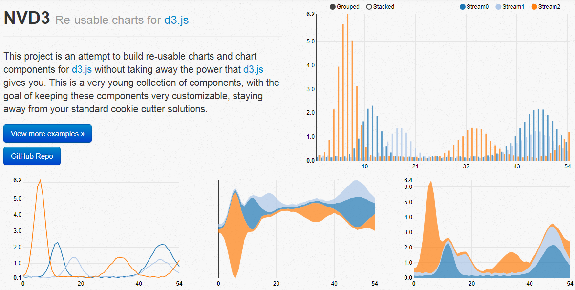
NVD3 是由 Mike Bostock 撰写的基于 D3 的 JavaScript 库。NVD3 允许用户在 Web 应用程序中创建美观且可复用的图表。
NVD3 具有强大的图表功能,能够方便地创建箱形图、旭日形和烛台图等。如果用户希望在 JavaScript 图表库中利用大量功能,推荐使用 NVD3。
NVD3 图表库的速度有时可能成为一个问题,与 Fastdom 安装配合使用时,速度会更快。
以下是使用 NVD3 绘制简单折线图的代码示例:
/*These lines are all chart setup. Pick and choose which chart features you want to utilize. */
nv.addGraph(function() {
 var chart = nv.models.lineChart()
  .margin({left: 100}) //Adjust chart margins to give the x-axis some breathing room.
  .useInteractiveGuideline(true) //We want nice looking tooltips and a guideline!
  .transitionDuration(350) //how fast do you want the lines to transition?
  .showLegend(true) //Show the legend, allowing users to turn on/off line series.
  .showYAxis(true) //Show the y-axis
  .showXAxis(true) //Show the x-axis
 ;

 chart.xAxis //Chart x-axis settings
 .axisLabel('Time (ms)')
 .tickFormat(d3.format(',r'));

 chart.yAxis //Chart y-axis settings
 .axisLabel('Voltage (v)')
 .tickFormat(d3.format('.02f'));

 /* Done setting the chart up? Time to render it!*/
 var myData = sinAndCos(); //You need data...

 d3.select('#chart svg') //Select the <svg> element you want to render the chart in.
 .datum(myData)  //Populate the <svg> element with chart data...
 .call(chart);  //Finally, render the chart!

 //Update the chart when window resizes.
 nv.utils.windowResize(function() { chart.update() });
 return chart;
});
/**************************************
 * Simple test data generator
 */
function sinAndCos() {
 var sin = [],sin2 = [],
 cos = [];

 //Data is represented as an array of {x,y} pairs.
 for (var i = 0; i < 100; i++) {
 sin.push({x: i, y: Math.sin(i/10)});
 sin2.push({x: i, y: Math.sin(i/10) *0.25 + 0.5});
 cos.push({x: i, y: .5 * Math.cos(i/10)});
 }

 //Line chart data should be sent as an array of series objects.
 return [
 {
 values: sin, //values - represents the array of {x,y} data points
 key: 'Sine Wave', //key - the name of the series.
 color: '#ff7f0e' //color - optional: choose your own line color.
 },
 {
 values: cos,
 key: 'Cosine Wave',
 color: '#2ca02c'
 },
 {
 values: sin2,
 key: 'Another sine wave',
 color: '#7777ff',
 area: true //area - set to true if you want this line to turn into a filled area chart.
 }
 ];
}
C3.js:基于 D3 的可定制图表库
C3.js
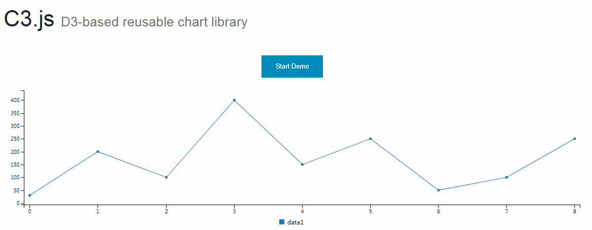
与 TauCharts 相同,C3.js 也是一个非常有效的基于 D3 的图表可视化库。此外,C3.js 允许用户创建可定制的、具有个人风格的类。
C3.js 看起来是一个比较难的库,但一旦掌握了 C3.js 的技巧,就能得心应手地使用。
使用 C3.js 图表库,即使在第一次渲染之后,用户也可以通过创建回调来更新图表。C3.js 还允许用户为自己的 Web 应用程序创建可复用的图表,从而减少工作量。
使用 npm 安装 C3.js 图表库的命令如下:
npm install c3
以下是使用 C3.js 绘制组合图的代码示例:
var chart = c3.generate({
 data: {
 columns: [
  ['data1', 30, 20, 50, 40, 60, 50],
  ['data2', 200, 130, 90, 240, 130, 220],
  ['data3', 300, 200, 160, 400, 250, 250],
  ['data4', 200, 130, 90, 240, 130, 220],
  ['data5', 130, 120, 150, 140, 160, 150],
  ['data6', 90, 70, 20, 50, 60, 120],
 ],
 type: 'bar',
 types: {
  data3: 'spline',
  data4: 'line',
  data6: 'area',
 },
 groups: [
  ['data1','data2']
 ]
 }
});
TauCharts:灵活的以数据为中心的图表库
TauCharts
TauCharts 是最灵活的 JavaScript 图表库之一。它是基于 D3 创建的,是一个以数据为中心的 JavaScript 图表库,可以改进数据可视化的效果。
TauCharts 十分灵活,访问其 API 也十分轻松。TauCharts 为用户提供了无缝映射和可视化的数据,使用 TauCharts 能够设计出十分美观的数据界面。同时,TauCharts 也易于学习。
通过 npm 安装 TauCharts 的命令如下:
npm install taucharts
以下是使用 TauCharts 绘制水平线的代码示例:
var defData = [
 {"team": "d", "cycleTime": 1, "effort": 1, "count": 1, "priority": "low"}, {
  "team": "d",
  "cycleTime": 2,
  "effort": 2,
  "count": 5,
  "priority": "low"
 }, {"team": "d", "cycleTime": 3, "effort": 3, "count": 8, "priority": "medium"}, {
  "team": "d",
  "cycleTime": 4,
  "effort": 4,
  "count": 3,
  "priority": "high"
 }, {"team": "l", "cycleTime": 2, "effort": 1, "count": 1, "priority": "low"}, {
  "team": "l",
  "cycleTime": 3,
  "effort": 2,
  "count": 5,
  "priority": "low"
 }, {"team": "l", "cycleTime": 4, "effort": 3, "count": 8, "priority": "medium"}, {
  "team": "l",
  "cycleTime": 5,
  "effort": 4,
  "count": 3,
  "priority": "high"
 },
 {"team": "k", "cycleTime": 2, "effort": 4, "count": 1, "priority": "low"}, {
  "team": "k",
  "cycleTime": 3,
  "effort": 5,
  "count": 5,
  "priority": "low"
 }, {"team": "k", "cycleTime": 4, "effort": 6, "count": 8, "priority": "medium"}, {
  "team": "k",
  "cycleTime": 5,
  "effort": 8,
  "count": 3,
  "priority": "high"
 }];
var chart = new tauCharts.Chart({
  data: defData,
  type: 'horizontalBar',
  x: 'effort',
  y: 'team',
  color:'priority'
 });
chart.renderTo('#bar');
Recharts:基于 React 的轻量级图表库
Recharts
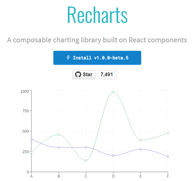
ReCharts 是一个使用 React 构建的、基于 D3 的图表库。
使用 ReCharts,用户可以在 React Web 应用程序中无缝地编写图表。
Recharts 非常轻巧,并使用 SVG 元素来创建奇特的图表。
使用 npm 安装 Recharts 的命令如下:
npm install recharts
Recharts 没有冗长的文档,它很直接。当遇到困难时,使用 Recharts 可以很容易找到解决方案。
以下是使用 Recharts 创建自定义内容树图的代码示例:
const {Treemap} = Recharts;

const data = [
  {
  name: 'axis',
  children: [
  { name: 'Axes', size: 1302 },
  { name: 'Axis', size: 24593 },
  { name: 'AxisGridLine', size: 652 },
  { name: 'AxisLabel', size: 636 },
  { name: 'CartesianAxes', size: 6703 },
  ],
  },
  {
  name: 'controls',
  children: [
  { name: 'AnchorControl', size: 2138 },
  { name: 'ClickControl', size: 3824 },
  { name: 'Control', size: 1353 },
  { name: 'ControlList', size: 4665 },
  { name: 'DragControl', size: 2649 },
  { name: 'ExpandControl', size: 2832 },
  { name: 'HoverControl', size: 4896 },
  { name: 'IControl', size: 763 },
  { name: 'PanZoomControl', size: 5222 },
  { name: 'SelectionControl', size: 7862 },
  { name: 'TooltipControl', size: 8435 },
  ],
  },
  {
  name: 'data',
  children: [
  { name: 'Data', size: 20544 },
  { name: 'DataList', size: 19788 },
  { name: 'DataSprite', size: 10349 },
  { name: 'EdgeSprite', size: 3301 },
  { name: 'NodeSprite', size: 19382 },
  {
  name: 'render',
  children: [
   { name: 'ArrowType', size: 698 },
   { name: 'EdgeRenderer', size: 5569 },
   { name: 'IRenderer', size: 353 },
   { name: 'ShapeRenderer', size: 2247 },
  ],
  },
  { name: 'ScaleBinding', size: 11275 },
  { name: 'Tree', size: 7147 },
  { name: 'TreeBuilder', size: 9930 },
  ],
  },
  {
  name: 'layout',
  children: [
   { name: 'AxisLayout', size: 6725 },
   { name: 'BundledEdgeRouter', size: 3727 },
   { name: 'CircleLayout', size: 9317 },
   { name: 'CirclePackingLayout', size: 12003 },
   { name: 'DendrogramLayout', size: 4853 },
   { name: 'ForceDirectedLayout', size: 8411 },
   { name: 'IcicleTreeLayout', size: 4864 },
   { name: 'IndentedTreeLayout', size: 3174 },
   { name: 'Layout', size: 7881 },
   { name: 'NodeLinkTreeLayout', size: 12870 },
   { name: 'PieLayout', size: 2728 },
   { name: 'RadialTreeLayout', size: 12348 },
   { name: 'RandomLayout', size: 870 },
   { name: 'StackedAreaLayout', size: 9121 },
   { name: 'TreeMapLayout', size: 9191 },
  ],
  },
  { name: 'Operator', size: 2490 },
  { name: 'OperatorList', size: 5248 },
  { name: 'OperatorSequence', size: 4190 },
  { name: 'OperatorSwitch', size: 2581 },
  { name: 'SortOperator', size: 2023 },
  ],
  }
 ];
const COLORS = ['#8889DD', '#9597E4', '#8DC77B', '#A5D297', '#E2CF45', '#F8C12D'];
const CustomizedContent = React.createClass({
 render() {
 const { root, depth, x, y, width, height, index, payload, colors, rank, name } = this.props;
 return (
 <g>
 <rect
  x={x}
  y={y}
  width={width}
  height={height}
  style={{
  fill: depth < 2 ? colors[Math.floor(index / root.children.length * 6)] : 'none',
  stroke: '#fff',
  strokeWidth: 2 / (depth + 1e-10),
  strokeOpacity: 1 / (depth + 1e-10),
  }}
 />
 {
  depth === 1 ?
  <text
  x={x + width / 2}
  y={y + height / 2 + 7}
  textAnchor="middle"
  fill="#fff"
  fontSize={14}
  >
  {name}
  </text>
  : null
 }
 {
  depth === 1 ?
  <text
  x={x + 4}
  y={y + 18}
  fill="#fff"
  fontSize={16}
  fillOpacity={0.9}
  >
  {index + 1}
  </text>
  : null
 }
 </g>
 );
 }
});

const SimpleTreemap = React.createClass({
 render () {
 return (
 <Treemap
  width={400}
 height={200}
 data={data}
 dataKey="size"
 ratio={4/3}
 stroke="#fff"
 fill="#8884d8"
 content={<CustomizedContent colors={COLORS}/>}
 />
 );
 }
})

ReactDOM.render(
 <SimpleTreemap />,
 document.getElementById('container')
);
Flot:基于 jQuery 的经典图表库
Flot
目前,jQuery 已成为 Web 开发人员非常重要的工具。有了 Flot.js,前端设计也变得更加容易。
Flot.js 是 JavaScript 库中较为古老的图表库之一。尽管如此,Flot.js 在绘制折线图、饼图、条形图、面积图甚至堆叠图表时,并不会降低其性能。
Flot.js 拥有完善的文档。当用户遇到困难时,可以很容易地找到解决办法。Flot.js 也支持旧版浏览器。
可以选择不使用 npm 来安装 Flot.js,而是在 HTML5 中直接包含 jQuery 和 JavaScript 文件。
以下是 Flot.js 的基本用法代码示例:
$(function () {
 var d1 = [];
 for (var i = 0; i < 14; i += 0.5)
 d1.push([i, Math.sin(i)]);

 var d2 = [[0, 3], [4, 8], [8, 5], [9, 13]];

 // a null signifies separate line segments
 var d3 = [[0, 12], [7, 12], null, [7, 2.5], [12, 2.5]];

 $.plot($("#placeholder"), [ d1, d2, d3 ]);
});
总结
总结
以上介绍的 JavaScript 库均为高质量的图表库。然而,在学习这些库的过程中,可能会因学习曲线陡峭或缺乏学习资料而遇到困难。一种较好的解决方案是将这些库结合起来使用。最后,也欢迎大家补充更多的 JavaScript 图表库。
JS处理含Emoji或中文的字符串转数组乱码问题
2026-11-05 16:12:28
JS怎么使用展开运算符合并对象
2026-11-05 14:42:18
ES6+环境下判断JS对象为空的简洁写法
2026-11-05 12:12:23
怎么通过replacer函数自定义JS中JSON的格式化输出
2026-11-05 11:19:44
JS正则表达式基础:字面量与RegExp构造函数的区别及常用元字符
2026-11-05 11:16:58