
JavaScript实现轮播图与Tab切换:完整交互代码实例
详解使用原生JavaScript实现选项卡(Tab切换)与轮播图的完整交互代码。解析两者的统一状态驱动模型、定时器生命周期管理、无缝平移技巧及动画防抖节流。
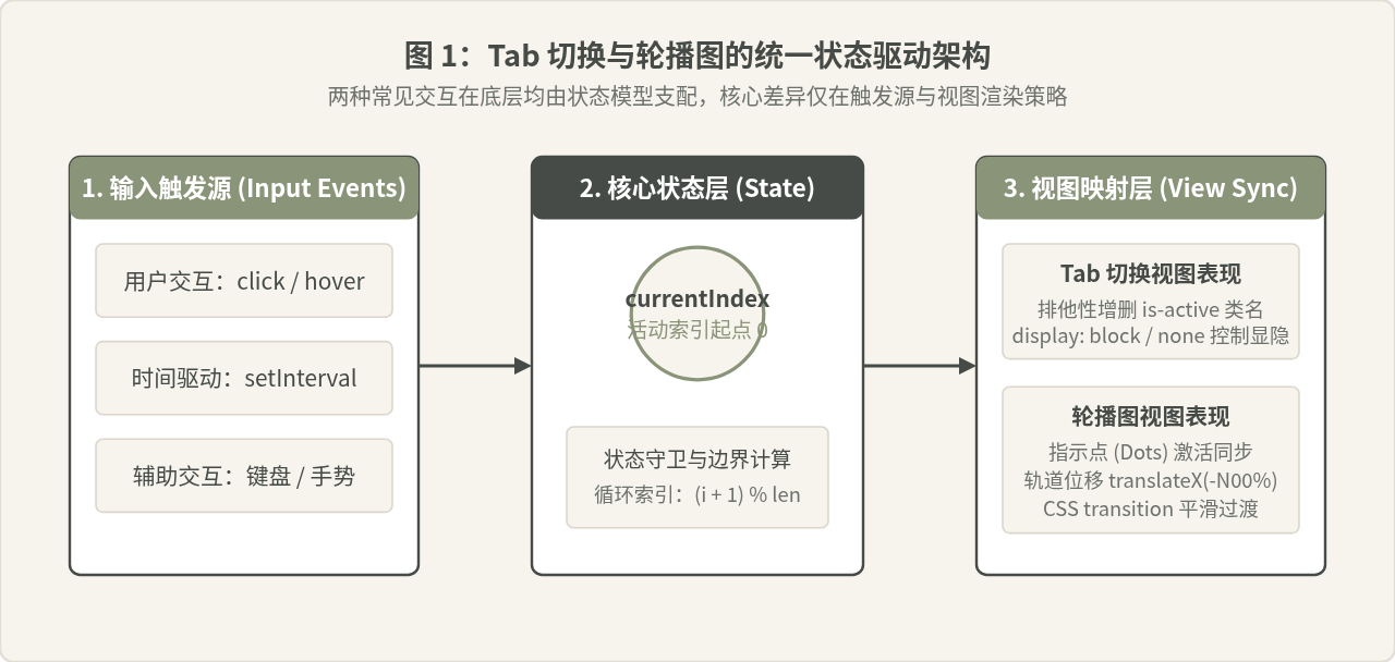
选项卡(Tab)切换与轮播图(Carousel)是前端界面中最基础也最高频出现的交互组件。许多初学者常将它们视作两个完全不同的模块分别编写,但在状态驱动的视角下,二者的本质完全一致:它们都维护着一个核心活动索引(currentIndex),并通过特定触发源(用户点击、滑动或时间驱动的定时器)改变该索引,最终将索引值同步映射到视图层(显隐切换、样式激活或容器平移)。本文将基于原生 JavaScript,分别给出规范、健壮的完整实现代码,深入剖析状态流转机制与常见的定时器、动画冲突等避坑要点。
一、Tab 切换的结构设计与完整实现
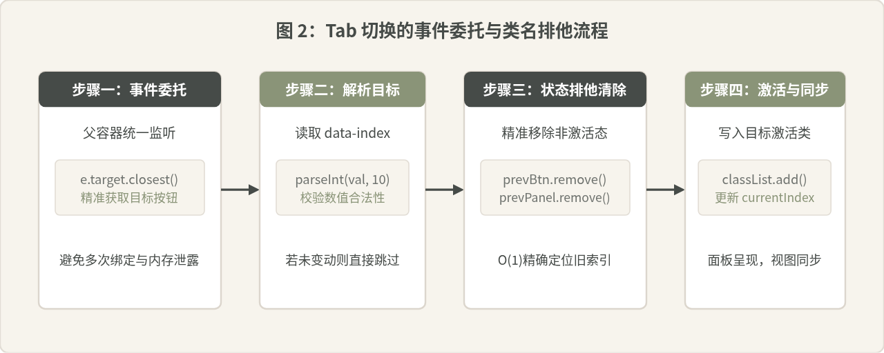
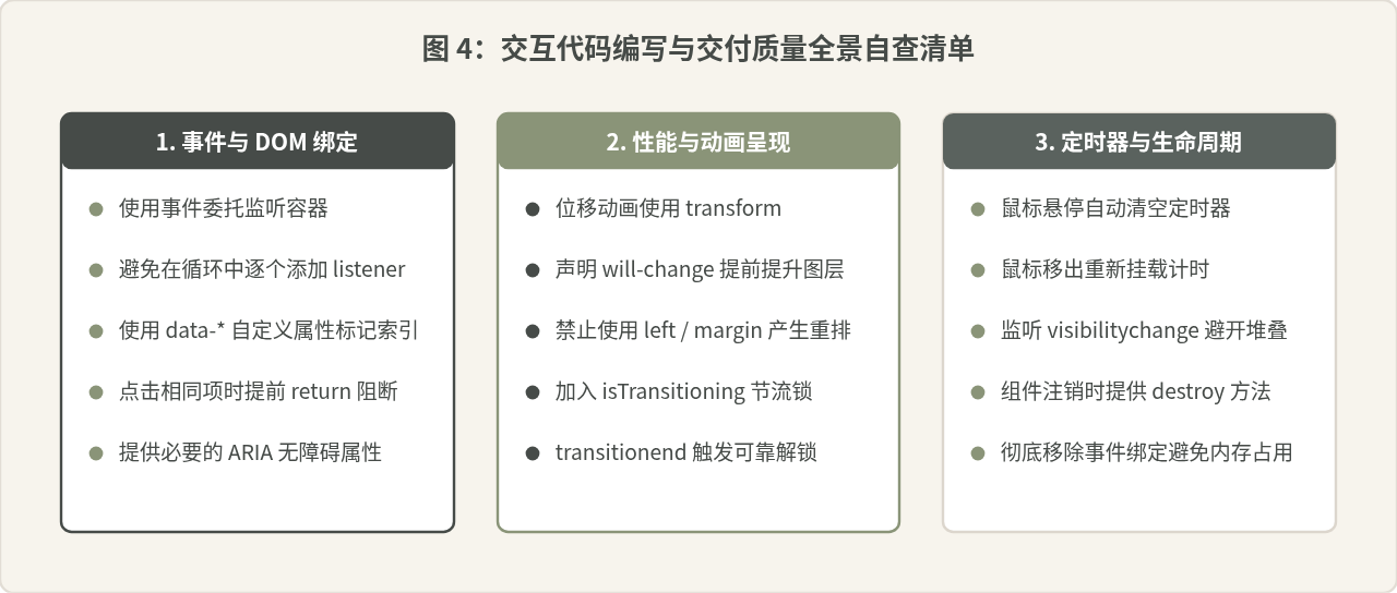
选项卡的核心功能是“在一组互斥的内容区块中,根据用户的选中动作仅展示一个区块”。规范的实现需要做到两点:第一,HTML 具备清晰的关联语义,方便通过自定义属性定位;第二,避免对每个按钮单独绑定事件监听器,使用事件委托(Event Delegation)统一管理。
1. HTML 与 CSS 样式结构
为确保高可读性与易维护性,我们将标签按钮存放在 .tab-nav 容器中,并通过 data-index 自定义属性标记其索引值;内容面板存放在 .tab-content 中。通过激活类 is-active 控制选中外观与显示。
<!-- Tab 切换完整 HTML 结构 -->
<div class="tab-component" id="myTab">
  <!-- 导航头部 -->
  <div class="tab-nav" role="tablist">
    <button class="tab-btn is-active" data-index="0" role="tab">基础配置</button>
    <button class="tab-btn" data-index="1" role="tab">高级选项</button>
    <button class="tab-btn" data-index="2" role="tab">调用日志</button>
  </div>

  <!-- 对应内容面板 -->
  <div class="tab-panels">
    <div class="tab-panel is-active" role="tabpanel">面板 1:基础配置内容区域</div>
    <div class="tab-panel" role="tabpanel">面板 2:高级参数调优与阈值设定</div>
    <div class="tab-panel" role="tabpanel">面板 3:近期接口请求追踪与异常排查</div>
  </div>
</div>
配套样式采用类名切换策略,默认将非激活面板隐藏,代码如下:
/* 基础重置与布局 */
.tab-component {
  width: 100%;
  border: 1px solid #E2DDD5;
  border-radius: 6px;
  background: #FFFFFF;
  overflow: hidden;
}
.tab-nav {
  display: flex;
  background-color: #F7F4ED;
  border-bottom: 1px solid #E2DDD5;
}
.tab-btn {
  flex: 1;
  padding: 12px 16px;
  border: none;
  background: transparent;
  font-size: 14.5px;
  color: #5A625E;
  cursor: pointer;
  transition: all 0.2s ease;
}
.tab-btn:hover {
  color: #2C3330;
}
/* 激活态按钮高亮 */
.tab-btn.is-active {
  background: #FFFFFF;
  color: #464B48;
  font-weight: 600;
  border-bottom: 2px solid #8A9478;
}
/* 面板切换规则 */
.tab-panel {
  display: none;
  padding: 24px;
  font-size: 15px;
  color: #2C3330;
}
.tab-panel.is-active {
  display: block;
}
2. 原生 JavaScript 交互实现
在 JavaScript 中,最清晰的做法是维护一个切换函数 switchTab(targetIndex)。事件监听只挂载在父级 .tab-nav 上,利用事件冒泡捕获点击事件并读取 e.target.dataset.index。
class TabSwitcher {
  constructor(containerSelector) {
    this.container = document.querySelector(containerSelector);
    if (!this.container) return;

    this.nav = this.container.querySelector('.tab-nav');
    this.buttons = Array.from(this.container.querySelectorAll('.tab-btn'));
    this.panels = Array.from(this.container.querySelectorAll('.tab-panel'));
    this.currentIndex = 0;

    this.init();
  }

  init() {
    // 使用事件委托处理导航项点击
    this.nav.addEventListener('click', (event) => {
      const targetBtn = event.target.closest('.tab-btn');
      if (!targetBtn) return;

      const targetIndex = parseInt(targetBtn.dataset.index, 10);
      if (!isNaN(targetIndex) && targetIndex !== this.currentIndex) {
        this.switchTo(targetIndex);
      }
    });
  }

  switchTo(index) {
    if (index < 0 || index >= this.buttons.length) return;

    // 移除旧有激活项
    this.buttons[this.currentIndex].classList.remove('is-active');
    this.panels[this.currentIndex].classList.remove('is-active');

    // 激活新目标项
    this.currentIndex = index;
    this.buttons[this.currentIndex].classList.add('is-active');
    this.panels[this.currentIndex].classList.add('is-active');
  }
}

// 实例化初始化
document.addEventListener('DOMContentLoaded', () => {
  new TabSwitcher('#myTab');
});
二、轮播图的完整交互实现
轮播图在 Tab 切换的基础上增加了三大特性:时间驱动的自动步进、左右翻页控制以及滑动过渡动画。实现平滑且稳定的轮播图,关键在于构建一个“滑动轨道(Track)”并通过 CSS transform: translateX() 进行硬件加速位移,而不是通过低性能的 left 或 margin-left 驱动。
1. 轮播图 HTML 与 CSS 布局
轮播图最外层设立一个固定视口(Viewport)并设置 overflow: hidden;内层放置横向排布的轨道容器,包裹所有轮播项;同时提供上一张/下一张按钮及底部圆点指示器。
<!-- 轮播图完整 HTML 结构 -->
<div class="carousel-container" id="myCarousel">
<!-- 可视视口与滑动轨道 -->
<div class="carousel-viewport">
<div class="carousel-track">
<div class="carousel-slide slide-1">第一张:产品核心亮点</div>
<div class="carousel-slide slide-2">第二张:系统架构全景</div>
<div class="carousel-slide slide-3">第三张:多场景解决方案</div>
</div>
</div>
<!-- 左右翻页控制器 -->
<button class="carousel-btn prev-btn" aria-label="上一页"><</button>
<button class="carousel-btn next-btn" aria-label="下一页">></button>
<!-- 底部圆点分页指示器 -->
<div class="carousel-dots">
<span class="dot is-active" data-index="0"></span>
<span class="dot" data-index="1"></span>
<span class="dot" data-index="2"></span>
</div>
</div>配套样式如下:使用 Flex 布局使所有幻灯片单行并列排布,每个幻灯片宽度保持 100%。
.carousel-container {
  position: relative;
  width: 100%;
  max-width: 720px;
  margin: 0 auto;
  border-radius: 8px;
  overflow: hidden;
  box-shadow: 0 4px 12px rgba(0, 0, 0, 0.08);
}
.carousel-viewport {
  width: 100%;
  overflow: hidden;
}
.carousel-track {
  display: flex;
  width: 100%;
  transition: transform 0.4s cubic-bezier(0.25, 1, 0.5, 1);
  will-change: transform;
}
.carousel-slide {
  flex: 0 0 100%;
  min-height: 280px;
  display: flex;
  align-items: center;
  justify-content: center;
  font-size: 22px;
  color: #FFFFFF;
}
.slide-1 { background-color: #6C7A5D; }
.slide-2 { background-color: #55625D; }
.slide-3 { background-color: #7A6F5D; }

/* 左右按钮 */
.carousel-btn {
  position: absolute;
  top: 50%;
  transform: translateY(-50%);
  width: 40px;
  height: 40px;
  background-color: rgba(30, 35, 33, 0.45);
  color: #FFFFFF;
  border: none;
  border-radius: 50%;
  cursor: pointer;
  font-size: 18px;
  display: flex;
  align-items: center;
  justify-content: center;
  transition: background-color 0.2s;
}
.carousel-btn:hover {
  background-color: rgba(30, 35, 33, 0.75);
}
.prev-btn { left: 16px; }
.next-btn { right: 16px; }

/* 底部圆点 */
.carousel-dots {
  position: absolute;
  bottom: 14px;
  left: 50%;
  transform: translateX(-50%);
  display: flex;
  gap: 8px;
}
.dot {
  width: 10px;
  height: 10px;
  border-radius: 50%;
  background: rgba(255, 255, 255, 0.5);
  cursor: pointer;
  transition: all 0.25s ease;
}
.dot.is-active {
  background: #FFFFFF;
  width: 24px;
  border-radius: 5px;
}
2. 轮播图交互与生命周期驱动代码
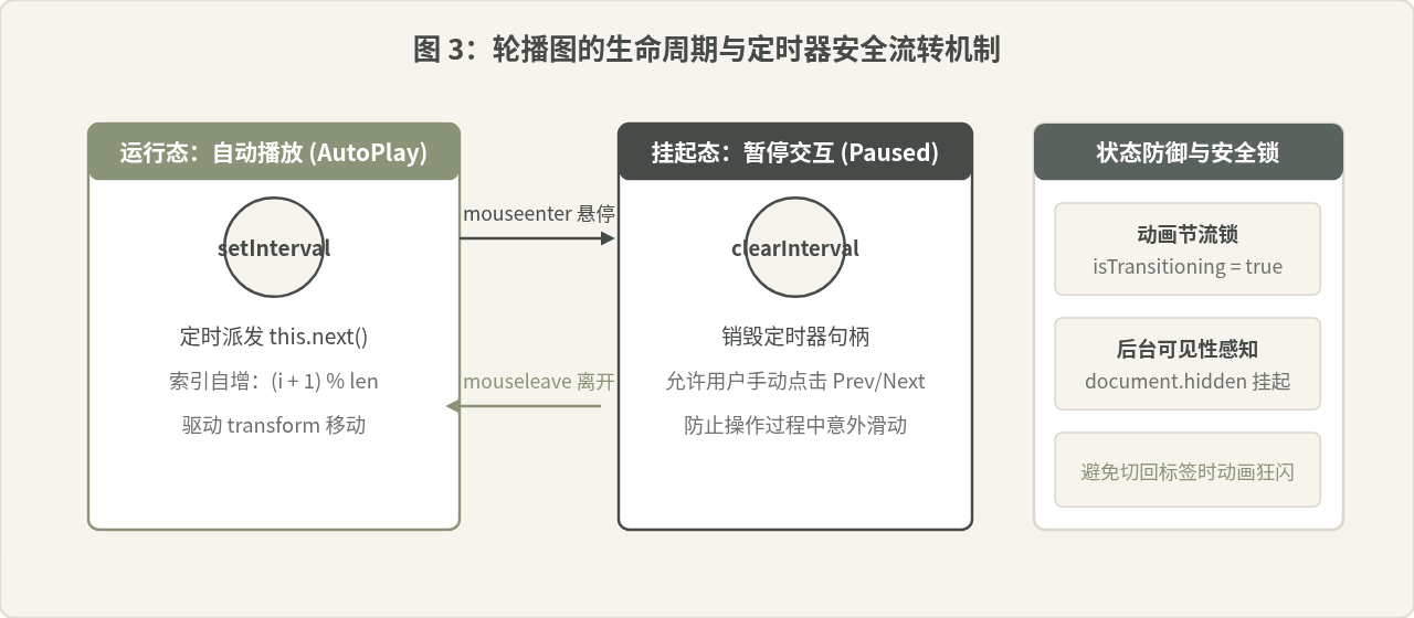
轮播图的 JavaScript 需要处理好自动播放定时器(setInterval)、鼠标悬停暂停(mouseenter/mouseleave)、点击防抖(Throttling)以及指示点同步。完整代码如下:
class CarouselSlider {
  constructor(containerSelector, options = {}) {
    this.container = document.querySelector(containerSelector);
    if (!this.container) return;

    this.track = this.container.querySelector('.carousel-track');
    this.slides = Array.from(this.container.querySelectorAll('.carousel-slide'));
    this.dots = Array.from(this.container.querySelectorAll('.dot'));
    this.prevBtn = this.container.querySelector('.prev-btn');
    this.nextBtn = this.container.querySelector('.next-btn');

    this.total = this.slides.length;
    this.currentIndex = 0;
    this.intervalDuration = options.duration || 3500;
    this.timer = null;
    this.isTransitioning = false; // 动画节流锁

    this.init();
  }

  init() {
    // 1. 左右按钮翻页
    this.prevBtn.addEventListener('click', () => this.prev());
    this.nextBtn.addEventListener('click', () => this.next());

    // 2. 指示圆点点击(事件委托)
    const dotsContainer = this.container.querySelector('.carousel-dots');
    dotsContainer.addEventListener('click', (e) => {
      if (e.target.classList.contains('dot')) {
        const targetIdx = parseInt(e.target.dataset.index, 10);
        this.goTo(targetIdx);
      }
    });

    // 3. 悬停暂停与移出继续
    this.container.addEventListener('mouseenter', () => this.stopAutoPlay());
    this.container.addEventListener('mouseleave', () => this.startAutoPlay());

    // 4. 监听过渡结束释放节流锁
    this.track.addEventListener('transitionend', () => {
      this.isTransitioning = false;
    });

    // 5. 启动自动轮播
    this.startAutoPlay();
  }

  goTo(targetIndex) {
    if (this.isTransitioning || targetIndex === this.currentIndex) return;
    if (targetIndex < 0 || targetIndex >= this.total) return;

    this.isTransitioning = true;
    this.currentIndex = targetIndex;
    this.render();
  }

  next() {
    if (this.isTransitioning) return;
    const nextIdx = (this.currentIndex + 1) % this.total;
    this.goTo(nextIdx);
  }

  prev() {
    if (this.isTransitioning) return;
    const prevIdx = (this.currentIndex - 1 + this.total) % this.total;
    this.goTo(prevIdx);
  }

  render() {
    // 硬件加速位移
    const offset = -this.currentIndex * 100;
    this.track.style.transform = `translateX(${offset}%)`;

    // 同步圆点状态
    this.dots.forEach((dot, idx) => {
      dot.classList.toggle('is-active', idx === this.currentIndex);
    });
  }

  startAutoPlay() {
    if (this.timer) return;
    this.timer = setInterval(() => {
      this.next();
    }, this.intervalDuration);
  }

  stopAutoPlay() {
    if (this.timer) {
      clearInterval(this.timer);
      this.timer = null;
    }
  }
}

// 页面加载完毕后运行
document.addEventListener('DOMContentLoaded', () => {
  new CarouselSlider('#myCarousel', { duration: 3000 });
});
三、容易混淆的认知与关键踩坑排查
1. 常见观点辨析:“轮播图与 Tab 是完全不同的两套组件”
很多开发者在初学时认为 Tab 和轮播图毫无关联,理由很直观:Tab 是静态的面板点击切换,而轮播图具有自动滚动、左右按钮、过渡动画以及连续平移的视效。这种看法在表现层是成立的,因为两者的交互节奏与视觉样式完全不同。
然而在架构设计层面,这一认知存在局限。仔细拆解会发现:轮播图本质上就是一个“带有自动定时步进器、支持滑动动画、并自带快捷上下项控制”的 Tab 扩展形态。底部的圆点(Dots)就是 Tab 的按钮,每一个幻灯片就是 Tab 的面板。若将二者看作孤立组件,容易写出大量重复的索引管理逻辑;若从“状态驱动”的角度抽象,只需要一个基础的索引状态调度器,外层分别接入按钮视图与平移轨道即可。
2. 典型故障:后台切标签后切回,轮播图“疯狂快转”
原因排查:现代浏览器为了节省电量与性能,当用户切换到其他浏览器标签页时,会将后台页面的 setInterval 和 setTimeout 降频甚至挂起,但回调队列可能在切回前夕或恢复瞬间被密集清空,导致累积的 CSS 过渡在极短时间内连续触发,界面呈现快速抽搐与闪烁。
解决办法:利用浏览器的 Page Visibility API。在页面不可见(document.hidden === true)时主动暂停定时器,在用户重新聚焦页面时恢复:
// 在初始化方法中添加页面可见性监听
document.addEventListener('visibilitychange', () => {
  if (document.hidden) {
    this.stopAutoPlay();
  } else {
    this.startAutoPlay();
  }
});
3. 动画冲突:快速疯狂点击导致画面错位或停滞
表现:用户快速连续点击“下一张”或指示圆点,CSS 过渡尚未完成就触发了下一次位移计算,导致 translateX 计算叠加,甚至出现轨道卡在两张图中间无法归位的情况。
解决方案:引入状态锁(节流布尔标志 isTransitioning)。在过渡开始时置为 true,任何新的切换请求在锁未释放时直接 return;同时监听轨道的 transitionend 事件,在原生过渡彻底完成时才将锁重置为 false。切忌用固定时长的 setTimeout 解锁,因为如果系统发生卡顿导致动画延时,固定时长的解予定时器会提前释放,从而使防御失效。
注意:如果使用 CSS transition,务必保证不要在 transitionend 未完成时修改 style.transition 属性,否则可能丢失事件触发,导致锁永远处于激活状态无法解锁。
四、两大组件的核心差异与选型对照
在实际业务中,根据展示内容的重要性与用户交互预期选择合适的模式至关重要。下表给出了两者在设计与开发层面的量化对比:
| 对比维度 | 选项卡 (Tab 切换) | 轮播图 (Carousel) |
|---|---|---|
| 核心目的 | 组织平级信息,供用户主动选择查看 | 展示强视觉内容(Banner、推荐产品),兼具自动化展示 |
| 状态驱动源 | 仅用户主动交互(点击、方向键聚焦) | 用户交互 + 计时器周期驱动(双重驱动) |
| 典型视觉呈现 | 类名排他激活,非活动区 display: none |
视口溢出隐藏,轨道 transform: translateX() |
| 无障碍与友好性 | 天然适合键盘 TAB 与方向键无障碍切换 | 自动播放易干扰屏幕阅读器,必须提供暂停机制 |
| 性能关注点 | 面板首屏加载与局部重绘开销 | 硬件加速(GPU 合成层)、图片预加载与内存节流 |
总结
掌握 Tab 切换与轮播图的原生实现,不仅能够摆脱对重型第三方库的依赖、缩减首屏体积,更能加深对前端“状态与视图分离”思想的理解。无论交互效果多么复杂,核心步骤始终是:明确状态(currentIndex)、约束流转边界、借助事件委托捕获用户动作、并在合适时机通过 CSS 硬件加速属性完成视图映射。处理好定时器的创建与销毁、做好动画期间的节流拦截,就能写出高稳定性、高体验感的原生交互模块。
D3.js 处理大规模数据点的性能优化策略
2026-11-05 15:37:25
JS实现网页摄像头实时扫码:结合getUserMedia与jsQR教程
2026-11-05 15:27:28
D3.js v5 迁移到 v7 的 API 变更与注意事项
2026-11-05 11:57:17
使用 animate.js 实现多元素协同的序列动画
2026-11-04 22:27:53
JS拖拽排序时怎么添加平滑动画效果?FLIP技术实战
2026-11-04 10:12:22