

基于jQuery的响应式动画导航菜单实现
作者:竹影时间:2026-10-28 15:42:43浏览:226
本文介绍一款基于jQuery和CSS3的动画导航菜单。初始状态下页面中央显示一个控制按钮,单击该按钮可触发菜单项从左侧依次飞入页面;再次单击则使菜单飞回左侧消失。通过jQuery监听点击事件切换CSS类,利用CSS3的transition-delay属性实现各菜单项错开时间的动画效果,代码简洁且支持响应式布局。
jQuery动画导航菜单实现
今天给大家分享一款基于jQuery的动画导航菜单。该菜单在初始状态下,页面中央仅显示一个按钮。当用户单击该按钮时,菜单项会从左侧飞入页面中;再次单击按钮,导航菜单则会飞回左侧并消失。整个动画效果非常炫酷,具体效果如下图所示:
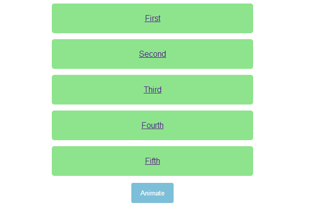
源码下载
HTML代码:
<ul>
<li><a href="http://www.w2bc.com">First</a></li>
<li><a href="http://www.w2bc.com">Second</a></li>
<li><a href="http://www.w2bc.com">Third</a></li>
<li><a href="http://www.w2bc.com">Fourth</a></li>
<li><a href="http://www.w2bc.com">Fifth</a></li>
</ul>
<button>
Animate</button>
<script src='jquery.js'></script>
<script> $('button').on('click', function () {
$('ul').toggleClass('animate');
}); //@ sourceURL=pen.js
</script>
CSS代码:
body
{
text-align: center;
}

ul
{
width: 400px;
padding: 0;
margin: 0 auto;
}
ul.animate li
{
transform: translate(0);
}
ul.animate li:nth-of-type(1)
{
transition-delay: 0.05s;
}
ul.animate li:nth-of-type(2)
{
transition-delay: 0.1s;
}
ul.animate li:nth-of-type(3)
{
transition-delay: 0.15s;
}
ul.animate li:nth-of-type(4)
{
transition-delay: 0.2s;
}
ul.animate li:nth-of-type(5)
{
transition-delay: 0.25s;
}

li
{
list-style: none;
display: block;
padding: 20px;
margin: 12px 0;
border-radius: 5px;
font-family: Helvetica, sans-serif;
color: #fff;
background: #8DE48D;
transform: translate(-500%);
transition: transform 0.75s cubic-bezier(0.175, 0.885, 0.32, 1.08);
}
li:nth-of-type(5)
{
transition-delay: 0.15s;
}
li:nth-of-type(4)
{
transition-delay: 0.3s;
}
li:nth-of-type(3)
{
transition-delay: 0.45s;
}
li:nth-of-type(2)
{
transition-delay: 0.6s;
}
li:nth-of-type(1)
{
transition-delay: 0.75s;
}

button
{
padding: 12px 18px;
border: none;
border-radius: 3px;
color: #fff;
background: #7DBED8;
}
button:focus
{
outline: none;
}
作者最新文章
网页开发三者分工:HTML结构、CSS样式与JavaScript交互怎么协作
2026-11-05 12:51:22
JS解析URL参数时怎么处理中文乱码和特殊字符
2026-11-05 12:47:23
js-cookie 存储 JSON 对象:自动序列化与反序列化技巧
2026-11-05 12:36:26
marked.js 快速上手:安装与基础 Markdown 转 HTML 示例
2026-11-05 09:32:53
Phaser.js 与 PixiJS、Cocos Creator 的技术选型对比
2026-11-05 08:36:30